
IELTS Writing Task 1 about Food and oil prices
The graph below shows changes in global food and oil prices between 2000 and 2011
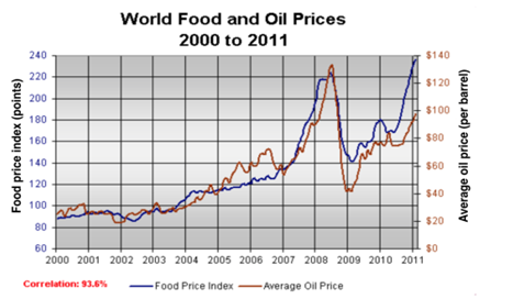
The line graph compares two different products including food and oil in terms of their average global prices throughout the period shown.
Overall, the prices for both items saw significantly upward trends over the eleven-year period. Also, there was a strong correlation (93.6 percent) between food and oil prices.
In 2000, an oil barrel had an average of nearly $25, and the food price index started at just over 90 points. Slight fluctuations in prices of two products can be seen in the following four years, but the numbers remained stable at around their starting point in the first year of the period. The average for food prices then went up substantially by more than one half, which coincided with a 140% increase in oil prices in 2007.
In 2008, food and oil prices rose much more quickly than one year earlier, with the former passing 220 points and the latter reaching its peak of around $130. In 2009, however, the average food price dropped suddenly to 140 points, while the oil price fell back to $40 per barrel. The year 2011 also witnessed dramatic recoveries in the figures for both products, when the food price index hit a peak at just below 240 points and the other one finished at $100.
Top answer
The line graph compares two different commodities, products including food and oil, in terms of their average global prices throughout the period shown. (What is the period? "from xxxx to yyyy") Overall, the prices for both items saw significant ly upward trends over the eleven-year period.
- The line graph compares two different commodities, products including food and oil, in terms of their average global prices throughout the period shown.
- (What is the period?
- "from xxxx to yyyy") Overall, the prices for both items saw significant ly upward trends over the eleven-year period.
- 6 percent) between food and oil prices.
- ) of nearly $25, and the food price index started at just over 90 points.
Get the Weekly English Kit 📬
New words, one handy idiom, and a 2-minute quiz — delivered to your inbox to keep your streak alive.
The line graph compares two different commodities, products including food and oil, in terms of their average global prices throughout the period shown. (What is the period? "from xxxx to yyyy")
Overall, the prices for both items saw significantly
 Related Questions