
Ielts Writing Task 1 (2 charts)
Can you help me to check this essay? I will appreciate your kind?
Topic: The graphs indicate the source of complaints about the Bank of America and the amount of time it takes to have the complaints resolved.
Summarise the information by selecting and report in the main features, and make comparisons where relevant.
Write at least 150 words.
Answer:
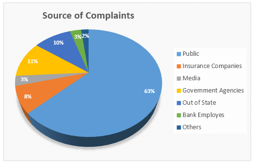
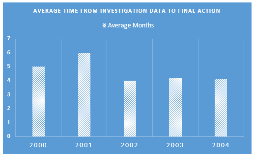
The pie chart compares the percentages of complaints made by seven different categories (Public, Insurance companies, Media, Government agencies, Out of State, Bank employees, and others) about the Bank of America, while the bar graph depicts the average time required to resolve those objections in a year.
It is clear that among seven entities, the highest percentage of the dissatisfaction came from the mass people. We also can see that the resolution time for those complaints varies from 4 to 6 months.
According to the pie chart, the highest portion of complaints about the Bank, more than 60%, was reported by the public while the second largest figure came from the government agencies, just over 11%. Insurance companies recorded 8% objections and the lowest ratio of those complaints was originated from the bank employees and out of state entities, 3 and 2 percent respectively. Interestingly only 3% of the dissatisfactions were presented by the media and the rest came from other sources.
From resolving time perspective, the Bank needed half a year to take necessary actions on those complaints in 2001, a month higher than in 2000. It also took them 4 months or approximately 5 months in the next three years to provide solutions to tackle the existent complaints.
Top answer
The pie chart compares the percentages of complaints made by seven different categories (Categories do not complain or make complaints. Be sure you accurately describe the graph. ) (Public, Insurance companies, Media, Government agencies, Out of State, Bank employees, and others) about the Bank of America, while the bar graph (wrong word) depicts the average time required to resolve those objections in a year.
- The pie chart compares the percentages of complaints made by seven different categories (Categories do not complain or make complaints.
- Be sure you accurately describe the graph.
- ) (Public, Insurance companies, Media, Government agencies, Out of State, Bank employees, and others) about the Bank of America, while the bar graph (wrong word) depicts the average time required to resolve those objections in a year.
- (Misleading.
- ) Suggestion: The two figures, a pie chart and a bar chart, give information about complaints against the Bank of America made during the five-year period 2000 to 2004.
Get the Weekly English Kit 📬
New words, one handy idiom, and a 2-minute quiz — delivered to your inbox to keep your streak alive.
The pie chart compares the percentages of complaints made by seven different categories (Categories do not complain or make complaints. Be sure you accurately describe the graph. ) (Public, Insurance companies, Media, Government agencies, Out of State, Bank employees, and others) about the Bank of America, while the bar graph (wrong word
 Related Questions