
IELTS Writing Task 1
10 days left until my test. Still struggle with writing
--------------------------------------
The chart below shows the average household spending pattern for households in
three income categories as a proportion of their income.
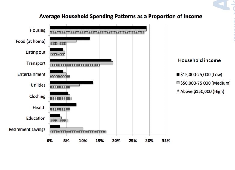
The bar chart compares the proportion of household spending in three household groups categorized by their income.
Overall, while the three groups spend mostly on housing and transport, they spend a very few amount of their budget on Eating out, Education and Entertainment.
In detail, all three groups spend almost 30% of their income on housing, with the high income group spend a little lower than the others. Transport is spent the highest percentage by the medium income group (nearly one-fifth), followed by the low group with just about 1% lower and the high group with exactly 15%. Low income earners spend more than other two groups on utilities (14%), food at home (12%) and health (8%), whereas high income ones spent the less on these categories, with only 5% spent on food at home and 6% on utilities and health. In contrast, the rich spent more than others on retirement saving (17%), clothing (6%), entertainment (6%) and education (just over 5%), while the poor spent just over 5% on clothing and less than 5% on other three categories. Noticeably, none of the household groups spend more than 5% of their budget on eating out.
Top answer
Corona 9002 10 days left until my test. Still struggle with writing They allow you to take the test multiple times if you are not happy the first time. Second time will be easier because you know what to expect.
- Corona 9002 10 days left until my test.
- Still struggle with writing They allow you to take the test multiple times if you are not happy the first time.
- Second time will be easier because you know what to expect.
Get the Weekly English Kit 📬
New words, one handy idiom, and a 2-minute quiz — delivered to your inbox to keep your streak alive.
Corona 900210 days left until my test. Still struggle with writing
They allow you to take the test multiple times if you are not happy the first time. Second time will be easier because you know what to expect.
The bar chart compares the proportion of household spending in three household groups categorized by their income. (I read that sentence a few times, but cannot understand what you are writing about. Not good. There are two different categories: groups of households and expense categories. In complex charts like this, you need two or three sentences for a clear description)
The bar chart compares the percentages of their income that households of three different income levels (low, medium and high) allocated across ten budget categories, including housing, transportation, food and utilities.
Overall, these categories totaled to more than 95% per income group, so the data represents complete budgets. The largest expense was for housing, followed by transport
 Related Questions