
IELTS WRITING TASK 1
TOPIC: The pie charts below show the greenhouse gas emissions for last year by sector for Australia and New Zealand.
Could you give me some advice about my essay, please? And an estimated band score for this task, please. Thank you very much.
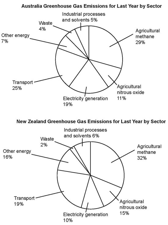
The pie charts compare different categories of greenhouse gas emitted from Australia and New Zealand in the previous year. Overall, the percentages of emissions from transport, electricity generation, and waste in Australia were higher than in New Zealand. At the same time, this figure from sources associated with industry, agriculture, and other energy in New Zealand exceeded that in Australia.
As can be seen, it was 25% of Australia's emissions from transport, compared to 19% of that in New Zealand. Similarly, electricity generation accounted for 19% of greenhouse gas in Australia, which was twice as much as in New Zealand at 10%. Last year, the figure for waste in New Zealand was half as in Australia (at 2% and 4% respectively).
Regarding agricultural methane and nitrous oxide, the proportions of greenhouse gas emitted from these in Australia last year were around 30% and 10%, which were lower than in New Zealand at 32% and 15% respectively. Apparently, both these countries had approximately 5% of their emissions from industrial processes and solvents, while other energy accounted for 7% of the co2 emissions in Australia last year, in comparison with over a double percentage at 16% in New Zealand.
Top answer
The pie charts How many pie charts? compare different categories How many categories? of greenhouse gas emitted from in Australia and New Zealand in the previous year.
- The pie charts How many pie charts?
- compare different categories How many categories?
- of greenhouse gas emitted from in Australia and New Zealand in the previous year.
- Start a new paragraph; the paragraph topic has changed.
- Overall, the percentages of emissions from transport, electricity generation, and waste in Australia were higher than in New Zealand.
Get the Weekly English Kit 📬
New words, one handy idiom, and a 2-minute quiz — delivered to your inbox to keep your streak alive.
The pie charts How many pie charts? compare different categories How many categories? of greenhouse gas emitted from in Australia and New Zealand in the previous year. Start a new paragraph; the paragraph topic has changed. Overall, t
 Related Questions