
IELTS WRITING TASK 1
Please give me feedback on this essay. Thank you very much.
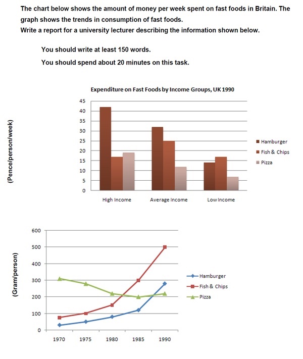
The bar chart presents how different income groups spent their money on hamburgers, fish and chips and pizza in the UK in 1990. The line graph compares the consumption pattern of those foods from 1970 to 1990.
Overall, high income group spent significantly more money than the other groups on these food items. While there was an upward trend in consuming hamburgers and fish and chips, the figure for pizza decreased.
According to the bar chart, the expenditure of high income people on hamburgers was around 42 pence per person, compared with 32 pence for average income group. Moreover, fish and chips were paid out the most by the average income group, and the smallest amount of money spent on pizza was made by low income one, at just more than 5 pence per person.
Looking into the line graph, in 1970, the figure for hamburger was under 50 grams, while those for fish and chips and pizza were 90 grams and 300 grams respectively. However, by 1990, whereas fish and chips and hamburger consumption had increased sharply, there had been a decrease of nearly 100 grams in pizza consumption.
Top answer
You did not read my advice... I write about common vocabulary mistakes in task 1. IELTS TASK 1: Hints, Tips And Advice Vocabulary Words For Task 1: Reference Post
- You did not read my advice...
- I write about common vocabulary mistakes in task 1.
- IELTS TASK 1: Hints, Tips And Advice Vocabulary Words For Task 1: Reference Post
Get the Weekly English Kit 📬
New words, one handy idiom, and a 2-minute quiz — delivered to your inbox to keep your streak alive.
You did not read my advice...
I write about common vocabulary mistakes in task 1.
The bar chart presents (Read my advice for verbs to use here.) how (incorrect) different income groups spent their money on hamburgers, fish and chips and pizza in the UK in 1990. The line graph compares the consumption pattern (not good
 Related Questions