
IELTS WRITING TASK 1
Please give me feedback on this essay. Thank you very much
The chart shows the proportion of renewable energy in the total energy supply in 4 countries from 1997 to 2010.
The chart provides information about the per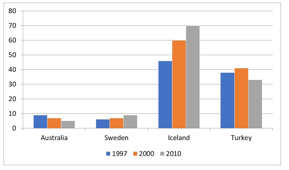
centage of renewable energy in total energy production in Australia, Sweden, Iceland and Turkey between 1997 and 2010.
Overall, Iceland held the top position for using renewable power, Turkey ranked the second. It can also be seen that Iceland and Turkey experienced an upward trend while Australia and Sweden experienced a downward one.
In 1997, almost a half of energy produced in Iceland came from renewable resources. This figure continued to grow steadily to 60% in 2000, then reached 70% in 2010. Meanwhile, there was a light fluctuation when it comes to this aspect of Turkey. The renewable energy rates rose from nearly 40% to about 41%, and declined by approximately 10% in 2010.
Regarding Australia, nearly 10% of the energy supply was renewable in 1997, and this figure decreased gradually to about 7% in 2000 and reached around 5% in 2010. In Sweden, the chart shows a gradual increase from about 6% in 1997 to nearly 10% in 2010.
Top answer
Please post essays, paragraphs, dialogues and other writing in the essay forum so a moderator does not have to move your post. Click on this link: Next, tap on the green button "write a new post"
- Please post essays, paragraphs, dialogues and other writing in the essay forum so a moderator does not have to move your post.
- Click on this link: Next, tap on the green button "write a new post"
Get the Weekly English Kit 📬
New words, one handy idiom, and a 2-minute quiz — delivered to your inbox to keep your streak alive.
The chart (What kind of chart is this? Be specific.) provides information about (not good. Information about percentage is puzzling. I have no idea what it means.. ) the percentage of renewable energy in out of total energy productio
 Related Questions