
Ielts Writing Task 1
The chart below shows the percentage of people accessing news via different
media in one country in 2013, 2015, and 2017.
Summarise the information by selecting and reporting the main features, and make
comparisons where relevant.
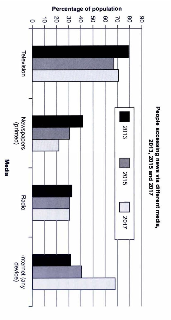
The bar chart illustrates the proportion of people accessing news through three different media in a particular country in three years, 2013, 2015, and 2017.
Overall, there were downward trends in the figure for television, newspaper, and radio whereas for internet showed the opposite trend. Television was the most popular media over the given period.
The percentage of the population who used television was nearly 80% in 2015. After a decrease to 68% in 2015, the figure increased to more than 70% in 2017. As regard, the access to newspapers fell from 41% to 21% over 4 years. A similar trend can be seen in the figure for radio, apart from a minimal decline from 32% to 30%, it remained unchanged till the end of the period.
By contrast, access to the internet went in the opposite direction. After two years marginal rose, it dramatically went to a little less than 70%.
Get the Weekly English Kit 📬
New words, one handy idiom, and a 2-minute quiz — delivered to your inbox to keep your streak alive.
 Related Questions