
IELTS WRITING TASK 1
The pie chart illustrates the feedback from 100 customers about the Parkway Hotel’s service in 2005 and 2010.
Overall, the number of guests rated excellent was the smallest, while satisfactory feedback made up the biggest part of the chart. In comparison, at the end of the period, rating very poor was the least significant part of the visitors’ responses, whereas good feedback was the largest.
Excellent feedback was only 5% in 2005, but there was a substantial increase in 2010, approximately 28%. Besides, good responses accounted for 14% in 2005 and grew dramatically to 25% in 2010.
In the other words, satisfactory reactions had the highest percentage at the first of the period, about 45%. However, it decreased considerably to 28% at the end of the period. In 2005, the number of visitors rated poor and very poor made up 21% and 15% respectively. These figures leveled off at 12% and 4% in 2010.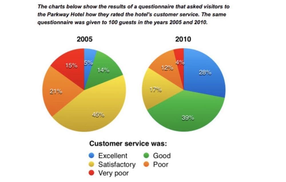
Top answer
The two pie char t s illustrates the feedback from 100 customers about the Parkway Hotel’s customer service in 2005 and 2010. Overall, Initially, the number of guests who rated the hotel as excellent was the smallest, while “ satisfactory ” feedback made up the biggest part largest sector of the chart. In comparison , five years later, at the end of the period, the rating “ very poor ” was the smallest sector, least significant part of the visitors’ responses, whereas “ good ” feedback was the largest.
- The two pie char t s illustrates the feedback from 100 customers about the Parkway Hotel’s customer service in 2005 and 2010.
- Overall, Initially, the number of guests who rated the hotel as excellent was the smallest, while “ satisfactory ” feedback made up the biggest part largest sector of the chart.
- In comparison , five years later, at the end of the period, the rating “ very poor ” was the smallest sector, least significant part of the visitors’ responses, whereas “ good ” feedback was the largest.
- That means the level of satisfaction increased over those five years.
- Excellent feedback was only 5% I n 2005, only 5% of respondents said customer service was excellent, but there was a substantial increase for that rating in 2010, to [ 1 ] approximately 28%.
Get the Weekly English Kit 📬
New words, one handy idiom, and a 2-minute quiz — delivered to your inbox to keep your streak alive.
The two pie charts illustrates the feedback from 100 customers about the Parkway Hotel’s customer service in 2005 and 2010.
Overall, Initially, the number o
 Related Questions