
Ielts writing task 1
Hi, please review this writing for me, thank you.
The graph below shows the differences in wheat exports over three different areas.
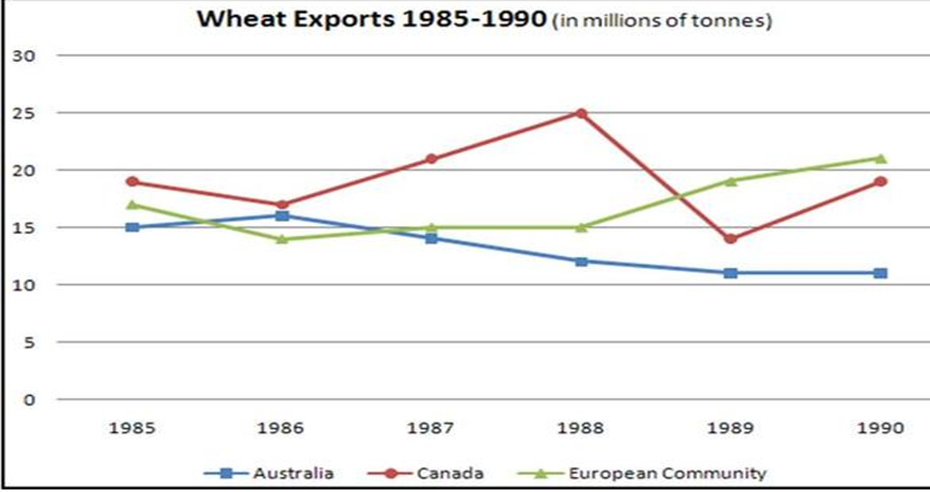
The line graph illustrates the number of wheats measured in millions of tonnes that was exported from three separate areas from 1985 to 1990.
Overall, the exportation of wheat from European Community saw a upward trend over the period given, while in Australia the figure decreased. Notably, the quantity of wheat export from Canada experienced the most dramatic changes, starting at the highest point of all approximately 20 millions of tonnes, and finishing at the same figure.
With regards to the wheat trading from European Community, it began at around 17 millions, after a mild decrease in 1986, it rose steadily to 1988 and finally rocketed to over 20 millions in 1990. On the contrary, the figure of Australia started at 15 millions, having had a slight rise in 1986, it proceeded to decline significantly and ended at just above 10 millions. As for the Canada’s wheat exportation, having reached its peak at about 25 millions, the figure declined dramatically in 1989, and was surpassed by European Community at the same year. Finally, it stopped at 20 millions in 1990.
Top answer
The line graph [ 1] illustrates the number of wheats compares the quantity of wheat, measured in millions of tonne s, that was exported from three regions separate areas from between 1985 to and 1990. Overall, the exportation of wheat exports from European Community saw a n upward trend over the period given, while in for Australia , there was a decline. the figure decreased.
- The line graph [ 1] illustrates the number of wheats compares the quantity of wheat, measured in millions of tonne s, that was exported from three regions separate areas from between 1985 to and 1990.
- Overall, the exportation of wheat exports from European Community saw a n upward trend over the period given, while in for Australia , there was a decline.
- the figure decreased.
- Notably, T he quantity of wheat export ed from Canada experienced the most dramatic changes, starting at the highest point of all approximately [ 2] 20 millions of tonnes, higher than the other two, peaking in the middle, and finishing back at its initial level.
- the same figure.
Get the Weekly English Kit 📬
New words, one handy idiom, and a 2-minute quiz — delivered to your inbox to keep your streak alive.
The line graph [ 1] illustrates the number of wheats compares the quantity of wheat, measured in millions of tonnes, that was exported from three regions separate areas from between 1985 to
 Related Questions