
IELTS Writing Task 1
Can you check my writing for me, please? I appreciate your help. Thank you
My essay:
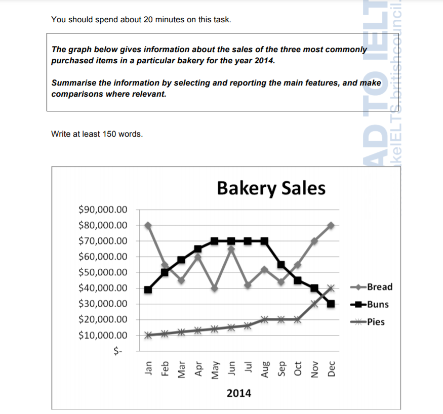
The line chart indicates the number of money was spent in the bakery on three different kinds of goods namely (Bread, Buns, and Pies) from January to December in 2014.
Overall, it is clear that bread and buns tend to have been more lucrative than pies but the sales of buns soaring high and drops like a rock in December. It can also be seen that both bread and pies upsurge peaking in December in 2014.
In greater detail, sales of bread in January were valued at $80,000 but this figure fell to around $45,000 in March. In that time their numbers fluctuated from $60,000 in April to $52,000 in August. It also varied a great deal, and in September the percentage dropped back to its starting point of $45,000 before rocketing up to finish at $80,000 in December.
In January, Bun sales stood at $40,000 but quickly rose to $70,000 in May and remained stable until August before they plummeted to just $30,000 in December. In addition, the value of pies sold slowly increased from $10,000 in January to reach $20,000 in August, then it climbed steadily to about $40,000 in December.
Top answer
The line chart (There are pie charts, bar charts, eye charts, organization charts and gantt charts, but there is no such thing as a line chart. ) indicates (Not a good word choice. ) the number of money (Money is non-count.
- The line chart (There are pie charts, bar charts, eye charts, organization charts and gantt charts, but there is no such thing as a line chart.
- ) indicates (Not a good word choice.
- ) the number of money (Money is non-count.
- ) was spent in a the bakery on three different kinds of goods, namely (Bread, Buns, and Pies) from January to December in 2014.
- Opening paragraph: The line graph plots the monthly income from the sales of each of three popular bakery items (bread, buns, and pies) during the year 2014.
Get the Weekly English Kit 📬
New words, one handy idiom, and a 2-minute quiz — delivered to your inbox to keep your streak alive.
The line chart(There are pie charts, bar charts, eye charts, organization charts and gantt charts, but there is no such thing as a line chart. Please learn the correct names of these figures.) indicates(Not a good word choice. ) the number of mon
 Related Questions