
Ielts writing task 1
Write a report for a university lecturer describing the information shown below.
The three pie charts illustrate the distribution of reside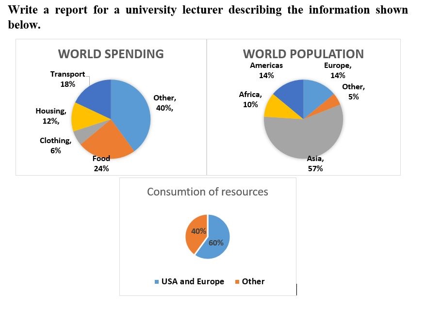
nts along with the global expenses and the resource consumption around the world, proportionally.
Roughly speaking, people seem to spend most of their income on food. Moreover, while the figures for people in America and Europe are just about a quarter of the world population, these areas consume more than half of the worldwide resouces.
The percentage of American and European population is quite low and both of them perfectly equal at 14%, but their consumption of resouces is nearly two thirds, worldwide. In constrast, Aisa has the highest proportion of residents at 57%, while its resource consumption including 15% of the people in Africa and other areas is just a little bit more than a third of global consumption.
When it comes to world expenses, people spend most of their income, at 24%, on food but only 6% on clothing. In housing, transport and others, the percentage of world spending on each categories is 12%, 18% and 40% respectively.
Top answer
Please check this writing task 1 for me
- Please check this writing task 1 for me
Get the Weekly English Kit 📬
New words, one handy idiom, and a 2-minute quiz — delivered to your inbox to keep your streak alive.
You wrote less than 130 words. The minimum is 150 words. Your score will be decreased for that reason.
The three pie charts illustrate the distribution of residents (wrong word) along with the global expenses (wrong word) and the resource consumption around the world, proporti
 Related Questions