
IELTS Writing task 1
Please help me to review this essay below. Thank you so much!
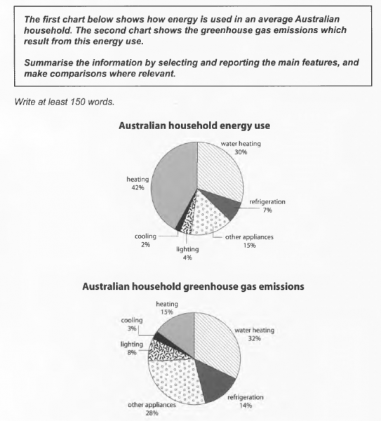
The given pie charts illustrate how Australian people use energy for some household works and how greenhouse gas emission is produced from these.
At first glance, it can be clearly seen that nearly half of the household energy is used for heating, however, it does not generate the largest amount of greenhouse gas emission, which is occupied by water heating.
In an average Australian household, 42% of energy is used for heating, followed by water heating at 30%. This proportion is recorded at 15%, 7%, 4% and 2% for other appliances, refrigeration, lighting and cooling respectively.
On the other hand, water heating and other appliance contribute the most to the emission of greenhouse gas, which accounts for 32% and 28% in that order. In addition, 15% of this emission is from heating, followed closely by refrigeration at 14%, whereas this figure only witnesses at around 3-8% for cooling and lighting.
Top answer
) pie charts illustrate (wrong word) how Australians people use energy for some household works (wrong word) and how much greenhouse gas emission is produced from these. ( How many categories? What are they?
- ) pie charts illustrate (wrong word) how Australians people use energy for some household works (wrong word) and how much greenhouse gas emission is produced from these.
- ( How many categories?
- What are they?
- Your first paragraph is not complete.
- ) At first glance, it can be clearly seen that (Delete those words.
Get the Weekly English Kit 📬
New words, one handy idiom, and a 2-minute quiz — delivered to your inbox to keep your streak alive.
The given (How many pie charts?) pie charts illustrate (wrong word) how Australians people use energy for some household works (wrong word) and how much greenhouse gas emission i
 Related Questions