
Ielts writing task 1
Hi everyone,
Please help me to check this essay. Thank you
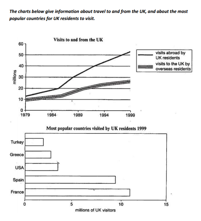
The line graph compares the number of visits to and from the UK from 1979 to 1999, and the bar chart illustrates the five most common nations travelled by UK citizens in 1999
Overall, the figures for travels to and from the UK both increased during the period. In addition, France was the most favored country among five nations visited by UK residents in 1999.
According to the line graph, in 1979, there were nearly 13 million overseas visits by UK people, which was slightly higher than the figure for visits to the UK, at about 10 million. In 1999, travels abroad by UK people witnessed a significant growth to more than 50 million, while there were less than 30 million visits to the UK by international citizens.
In the bar chart, in 1999, the number of visitors travelling to France was highest, at more than 10 million, while the figure for Spain was slightly lower, at around 9 million. At the same time, there were roughly 4 million UK residents who visited to the USA, whereas nearly 3 million UK people visited to Greece. By contrast, the Turkey’s figure was lowest, at over 2 million.
Top answer
) The line graph compares how many millions of visits foreigners made to the UK versus those made by the British to foreign countries between the years 1979 and 1999. The bar chart has a snapshot of the 1999 data, the number of visits the British made to the top five destination countries, in ascending order. These countries are: Turkey, Greece, the US, Spain and France.
- ) The line graph compares how many millions of visits foreigners made to the UK versus those made by the British to foreign countries between the years 1979 and 1999.
- The bar chart has a snapshot of the 1999 data, the number of visits the British made to the top five destination countries, in ascending order.
- These countries are: Turkey, Greece, the US, Spain and France.
- Overall, the numbers of figures for travels to and from the UK both increased during the period.
- In addition, France was the most favored country among five nations visited by UK residents in 1999.
Get the Weekly English Kit 📬
New words, one handy idiom, and a 2-minute quiz — delivered to your inbox to keep your streak alive.
The line graph compares the number of visits to and from the UK (That is not a completely adequate description of the line graph.) from 1979 to 1999, and the bar chart illustrates the five most common nations travelled (Incorrect grammar) by UK citizens in 1999 (missing punctuation.)
 Related Questions