
IELTS Writing Task 1
Please review it, thanks.
Line graph: The graph below compares changes in the birth rates of China and the USA between 1920 and 2000.
Summarise the information by selecting and reporting the main features, and make comparisons where relevant.
Red line: China
Blue line: the USA
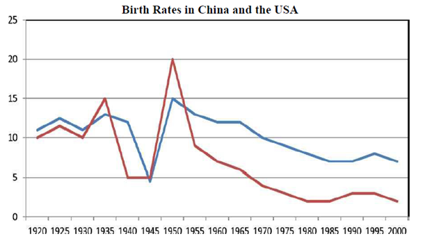
The line graph illustrates difference of birth rates between China and the USA from 1920 to 2000.
Overall, the birth rates in both countries declined over the period of 80 years. Although two trends was similar in term of decrease, the birth rate of China is lower than the figure for the USA in almost years.
The birth rate of the USA went up and down in the period from 1920 to 1940. In the next period, it fell rapidly to its lowest level under 5% in 1945. Then, there was a sharp increase in the figure for the USA to its highest level exactly 15% in 1950. However, it dropped gradually from 15% to approximately 7% between 1950 and 2000.
It can be seen from the graph that from1920 to 1935, the birth rate of China fluctuated. In the following period, there was a rapid fall to 5% in 1940. Dramatically, that of China reached its peak of 20% in 1950, which is the highest point throughout the period shown. Though, same as the figure for the USA in the remaining period, it declined gradually to about 2% in 2000.
Top answer
The line graph illustrates difference of birth rates between compares China and the USA in terms of their rates of birth from over the years 1920 to 2000. Overall, the birth rates in both countries followed a similar pattern declined over the that 80-year perio d. of 80 years.
- The line graph illustrates difference of birth rates between compares China and the USA in terms of their rates of birth from over the years 1920 to 2000.
- Overall, the birth rates in both countries followed a similar pattern declined over the that 80-year perio d.
- of 80 years.
- Although the two trends was similar in term of decrease, the birth rate of China is was lower than the figure for that of the USA in almost [ 1] all that period.
- years.
Get the Weekly English Kit 📬
New words, one handy idiom, and a 2-minute quiz — delivered to your inbox to keep your streak alive.
The line graph illustrates difference of birth rates between compares China and the USA in terms of their rates of birth from over the years 1920 to 2000.
Overall, the birth rates in both countries f
 Related Questions