
IELTS WRITING TASK 1
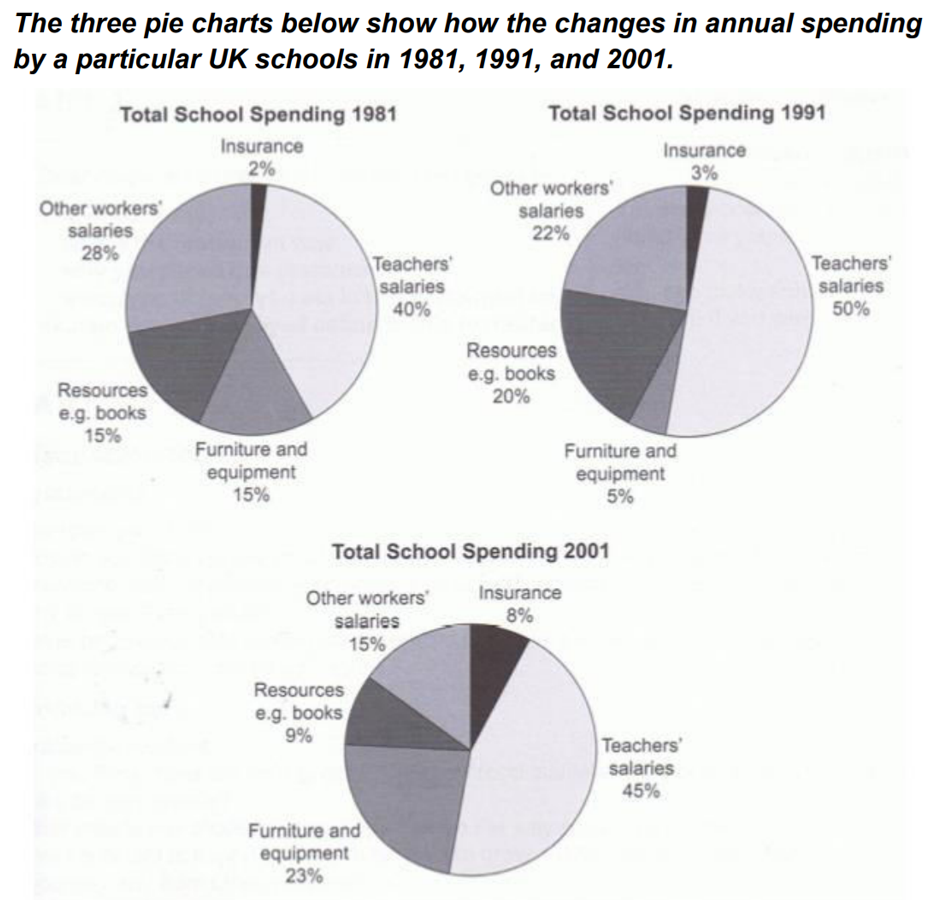
The pie charts compare the changes in yearly expenditure of a UK school in the years 1981, 1991 and 2001.
Overall, insurance accounted for the lowest percentage of school’s spending, while the highest cost went into salaries for teaching staff. Wages for other workers decreased steadily over the period shown.
Between 1981 and 1991, the proportion of teachers’ salaries experienced a significant increase, rising from 40% to half the school’s budget. Spending on teaching materials rose sharply by 5%, while there was a small increase of 1% in the figure for insurance. By contrast, the biggest decline was seen in the proportion of furniture and equipment, a fall of 10%.
In 2001, staff’s salaries made up the largest proportion of school’s expenditure, at 45%, followed by furniture and equipment, over half the figure for teaching staff. Total expenditure on teaching resources dropped noticeably by 11%, while the figure for insurance rose to 8%. There was a sharp drop of 8% in other workers’ wages, to just 15%.
Top answer
The description has a couple of serious grammatical errors. The three pie charts below show how the changes in annual spending by particular US school s in 1981, 1991 and 2002. The pie charts compare the changes in the yearly expenditures split into five categories of a UK school in the years 1981, 1991 and 2001.
- The description has a couple of serious grammatical errors.
- The three pie charts below show how the changes in annual spending by particular US school s in 1981, 1991 and 2002.
- The pie charts compare the changes in the yearly expenditures split into five categories of a UK school in the years 1981, 1991 and 2001.
- Overall, insurance accounted for the lowest percentage of (missing word) school’s spending, while the highest cost percentage went into salaries for teaching staff.
- Wages for other workers decreased steadily over the period shown.
Get the Weekly English Kit 📬
New words, one handy idiom, and a 2-minute quiz — delivered to your inbox to keep your streak alive.
The description has a couple of serious grammatical errors.
The three pie charts below show how the changes in annual spending by particular US schoolsin 1981, 1991 and 2002.
The pie charts compare the changes in the yearly e
 Related Questions