
Ielts Writing Task 1
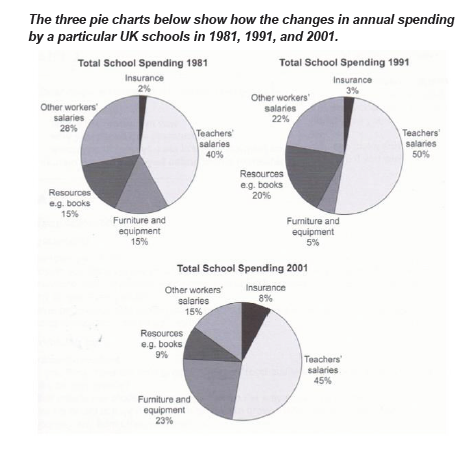
The three pie charts compare the expenditure of a school in the UK in three different years over a 20-year period.
It is clear that the teachers' salaries made up the largest proportion of the school's spending in all three years (1981, 1991, and 2001). By contrast, insurance was the smallest cost in each year.
In 1981, the highest proportion belonged to teachers' salaries, accounting for 40%. This figure was 12%, 38% higher than those of other workers' salaries as well as insurance, respectively. Also, it even kept a distance of 25% compared to the percentage of resources along with furniture and equipment, in that order.
Until 1991, the figure for teachers' salaries together with resources increase slightly by 10% as well as 5%, respectively. By contrast, there was a gradual fall in the data on other workers'salaries along with furniture and equipment to 22% and 5%, prior to.
Till 2001, the breakdowns of teachers' salaries, other workers 's salaries, resources displayed a steady fall to 45%, 15%, 9%, respectively. In contrary, the information on furniture and equipment displayed the strongest growth rate with an increase by 18%. Finally, the data on insurance was the lowest share during surveyed years, which rose slowly from 2% in 1981 to 8% in 2001.
Get the Weekly English Kit 📬
New words, one handy idiom, and a 2-minute quiz — delivered to your inbox to keep your streak alive.
 Related Questions