
IELTS Writing Task 1
I have just finished my essay on this task 1 question and I'll be grateful if you can help me to correct it.
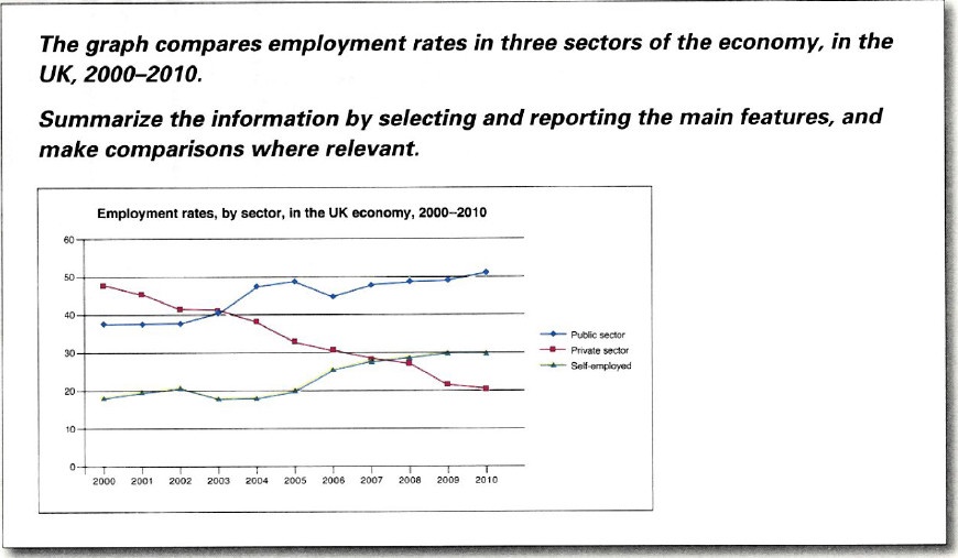
The line chart illustrates the percentage of the workforce in three different sectors of the UK’s economy from 2000 to 2010.
Overall, there were considerable rises in the rate of the self-employed and people who worked in public sector while private sector witnessed a downward trend over the period in question.
As for the details, although private sector covered the largest proportion at around 50% in 2000, it eventually became the least popular choice of the workers with more than 20% in 2010. By contrast, the rate of employment in private sector went in an opposite direction. Having levelled off in the first two years, the figure saw continued increases before it reached a peak of just under 50% in 2006. Despite a slight fall in 2006, private sector occupied the first position till the end of the period in question. In comparison to self-employment, the trend was relatively similar. There were ups and downs until 2006, at which point the rate of self-employed people showed constant increases, finishing at exactly 30% in 2010.
Get the Weekly English Kit 📬
New words, one handy idiom, and a 2-minute quiz — delivered to your inbox to keep your streak alive.
 Related Questions