
Ielts writing essay task 1
Greetings;
I would really appreciate it if you tell me about my mistakes in this essay.
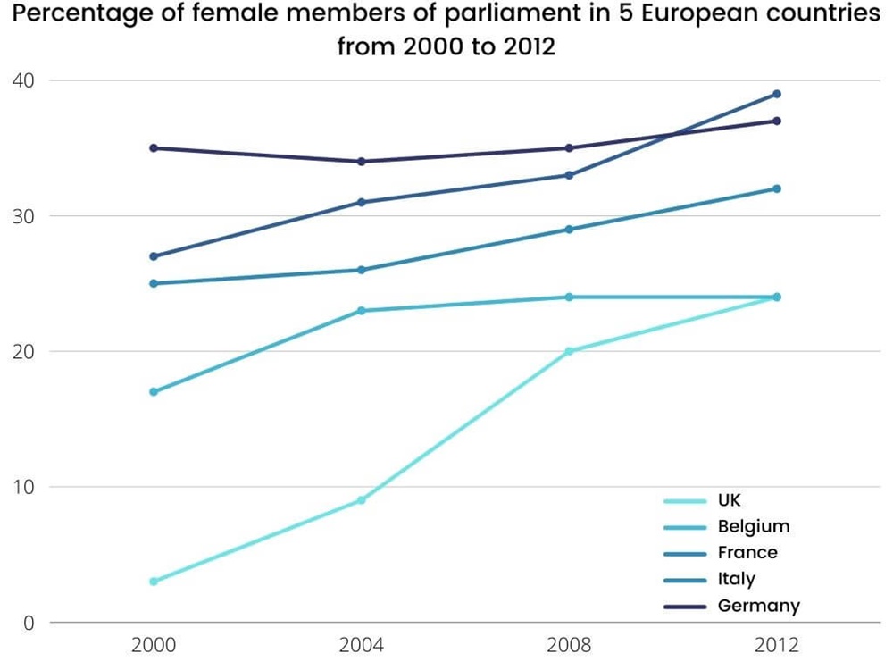
The line graph compares five European countries in terms of the proportion of female members in their parliament from 2000 to 2012.
Overall, the proportion of female population who were the parliament members increased in each country over the period shown, though there weren't striking changes in these countries expect in the UK. Meanwhile, Germany and Italy had the most female members compared to those three countries.
In 2000, Germany had the most female members by more than 35 percent, while the figure for Italy was lower by less than 30 percent. In 2012, the trend for Italy gained the highest point to near 40 percent and Germany was less than that by approximately 37 percent. The trends for Belgium and France stood at near 25 percent and 18 percent respectively in 2000 and with slightly differences they reached 32 percent and 22 percent respectively in 2012. The proportion of female members in the UK was the least in 2000 by less than 4 percent and with the sharp rise went up to the same position with Belgium in 2012.
Top answer
The line graph compares five European countries in terms of the proportion of female members in their parliamen t s from 2000 to 2012. Overall, the proportion of female population who were the parliament members MPs increased in each country over the period shown, though there [ 1] weren't striking changes in these countries expect with the largest rise being in the UK. Meanwhile, Germany and Italy had the most more female members compared to those the other three countries.
- The line graph compares five European countries in terms of the proportion of female members in their parliamen t s from 2000 to 2012.
- Overall, the proportion of female population who were the parliament members MPs increased in each country over the period shown, though there [ 1] weren't striking changes in these countries expect with the largest rise being in the UK.
- Meanwhile, Germany and Italy had the most more female members compared to those the other three countries.
- In 2000, Germany had the most female members (35), by more than 35 percent, while the figure for followed by Italy was lower by less than (27), France (25), Belgium (18), while the UK only had 3.
- percent.
Get the Weekly English Kit 📬
New words, one handy idiom, and a 2-minute quiz — delivered to your inbox to keep your streak alive.
The line graph compares five European countries in terms of the proportion of female members in their parliaments from 2000 to 2012.
Overall, the proportion of female population who were the parliament members MPs increased in each country ov
 Related Questions