
IELTS Writing Academic Task 1
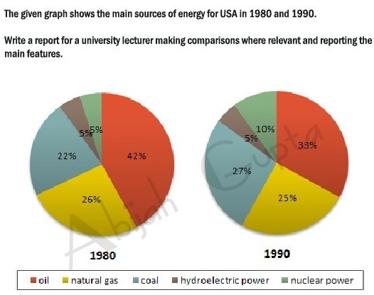
The pie chart illustrates the energy production from 5 different sources (oil, natural gas, coal, hydroeletric power and nuclear power) in the US in 2 different years (1980 and 1990).
Overall, it is clear that oil produced the most energy in both years as oppsed to energy production from hydroeletric power at the at the same time. Furthermore, a significant increase in the energy production from coal and nuclear power while a slight drop in that of natrual gas and oil.
The proportion of energy produced by oil accounted for 42% in 1980 and then dropped to a third (33%). The amount of energy production from hydroeletric power remained constant at mere 5% in both years.
From 1980 to 1990, there was a considerable increase in the figures of coal as well as nuclear power (from 5% to 10% and from 22% to 27% respectively). Whereas, the energy generated by natural gas, which was the second source of energy in the USA in 1980 fell by 1% to a quarter (25%) in 1990.
Top answer
) pie chart illustrates ( Illustrate means to make a picture. This verb is good for maps and process charts, which are diagrams, but not good for charts and graphs. ) different sources (oil, natural gas, coal, hydroeletric power and nuclear power) in the US in 2 different years (1980 and 1990).
- ) pie chart illustrates ( Illustrate means to make a picture.
- This verb is good for maps and process charts, which are diagrams, but not good for charts and graphs.
- ) different sources (oil, natural gas, coal, hydroeletric power and nuclear power) in the US in 2 different years (1980 and 1990).
- Overall, it is clear that oil produced the most energy in both years as oppsed to energy production from hydroeletric power at the at the same time.
- (This sentence makes no sense.
Get the Weekly English Kit 📬
New words, one handy idiom, and a 2-minute quiz — delivered to your inbox to keep your streak alive.
The (how many?) pie chart illustrates (Illustrate means to make a picture. This verb is good for maps and process charts, which are diagrams, but not good for charts and graphs. ) the energy production from 5 five (If a num
 Related Questions