
IELTS WRITING ACADEMIC TASK 1
The given line chart illustrates the figure for 3 sources of air pollutants measured in the UK during the period 1990 to 2005.
It is clear that there was an upward movement in the total number of air pollutants in the UK over the 15- year period. Furthermore, the decline in air pollutants from industry sources was particularly significant.
Looking at the information in more detail, in 1990, the total amount of air pollutants was exactly 7 million tonnes in the UK. After 9 years there was a significant decrease in the total number of air pollutants to figure for approximately 4 million tonnes and then continued to fall to about 3 million tonnes in 2005.
As illustrated, in 1990, industry sources accounted for roughly 5 million tonnes in the number of air pollutants in the UK, compared to just under a million tonnes from both transport and household. In 1996, the total amount of industry sources reached the 3 million tonnes mark, which was nearly triple as high as that for transport( around 1million tonne). At the end of the period, the air pollutants did not change position in relation to each other as industry sources accounted for 2 million tonnes, following by a million tone from transport and under a haft of a million tone from household.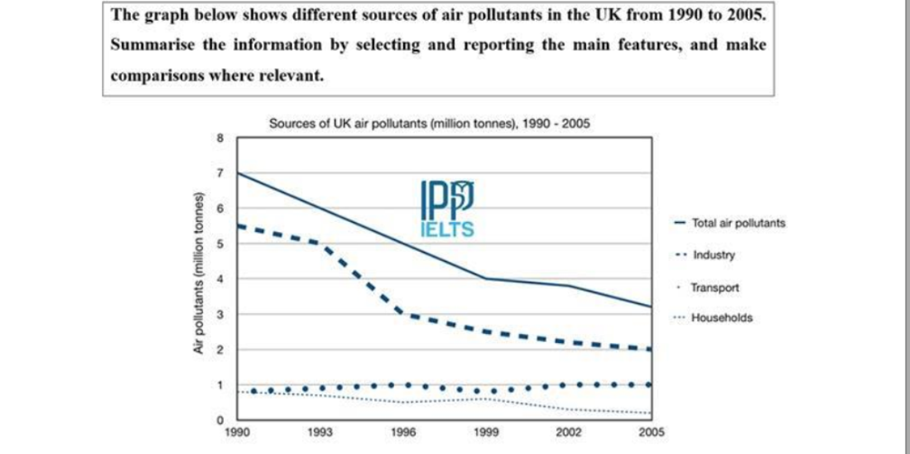
Top answer
You did not follow the advice that I gave you earlier. Please read it again. The given line chart (wrong word) illustrates (wrong word) the figure (wrong word.
- You did not follow the advice that I gave you earlier.
- Please read it again.
- The given line chart (wrong word) illustrates (wrong word) the figure (wrong word.
- Avoid the word "figure" to mean a value or number.
- ) for 3 three sources of air pollutants measured in the UK during the period 1990 to 2005.
Get the Weekly English Kit 📬
New words, one handy idiom, and a 2-minute quiz — delivered to your inbox to keep your streak alive.
You did not follow the advice that I gave you earlier. Please read it again.
The given line chart (wrong word) illustrates (wrong word) the figure (wrong word. Avoid the word "figure" to mean a v
 Related Questions