
IELTS Wri. Task 1 - Difference in income between genders
The graph shows the percentage of difference in income between men and women from 1978 to 2008.
My answer:
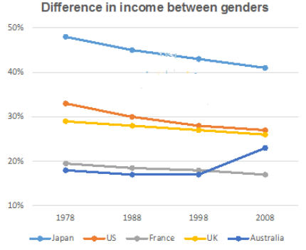
The line graph illustrates the income gap between genders in five different nations between 1978 to 2008.
Overall, it is clear that there was a reduction in the percentage difference in incomes of men and women for most of the period. However, after 1998, the percentage gap in gender incomes suddenly rose in Australia.
In 1978, there was a difference of almost 50% in incomes between men and women in Japan, compared to 33% in the US. Both countries then saw a steady reduction over the period between 1978 and 2008, so that the figures for Japan and the US by the year 2008 were over 40% and 28% respectively.
There was also a reduction in the income gap between men and women in the UK and France. The percentage differences in income between genders in those countries were lower than Japan or the US. Over the period of 30 years, these figures declined gradually from about 30% to over 25% in the UK and from 20% to 17% in France in 2008. In Australia, the difference in gender incomes was consistently lower than those of the other three countries, at 18% until 1998. After this time, it began to rise throughout the remainder of the period, and reached the peak of 25% in the year 2008, overtaking the figure for France.
Please help me find some mistake I have made in my essay. Thank you !!
Top answer
The line graph illustrates the income gap in percentages between men and women genders in five different nations between 1978 and to 2008. (What are these nations? ) Overall, it is clear that (That is an opinion.
- The line graph illustrates the income gap in percentages between men and women genders in five different nations between 1978 and to 2008.
- (What are these nations?
- ) Overall, it is clear that (That is an opinion.
- Do not write opinions or conclusions in Task 1.
- ) there was a reduction in the percentage difference in incomes of men and women for most of the period.
Get the Weekly English Kit 📬
New words, one handy idiom, and a 2-minute quiz — delivered to your inbox to keep your streak alive.
The line graph illustrates the income gap in percentages between men and women genders in five different nations between 1978 and to 2008. (What are these nations? Your overview is not
 Related Questions