
IELTS TEST TASK 1
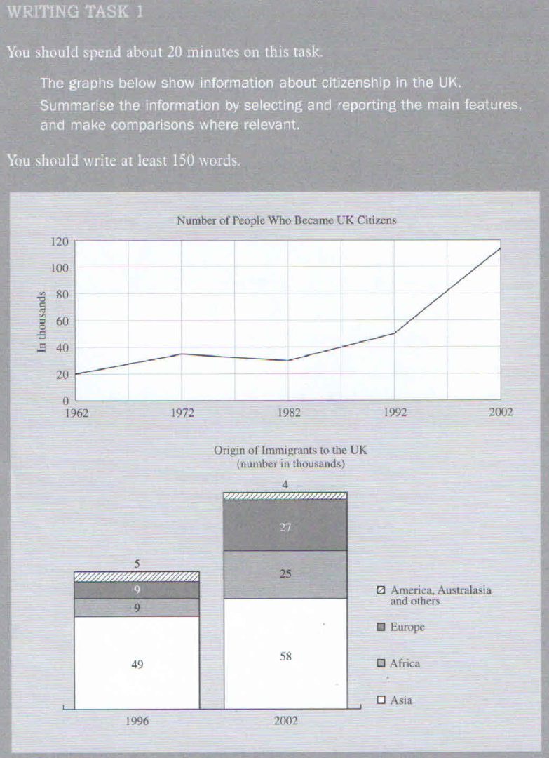
The line graph describes the number of people who became UK citizens between 1962 and 2002, and the bar chart gives information about the origin of immigrants to the UK.
In general, the figure of citizenship in the UK fluctuated slightly and the data of immigrants who obtained in UK increased in 1962 and 2002. Follow the line graph, in 1962 we can see the proportion of people who became UK citizens to STARTED WITH 20 thousands and almost grew up TO about 40 thousands in 1972. However, the next 10 years saw the number of people who became UK citizens declined TO about 30 thousands in 1982 and in 20 years latter, the figure reached the peak with 120 thousand.
Next, the bar chart indicates THE origin of immigrants to the UK. In 1996, most people came from Asia( 49 thousands ) and the number of immigrants to the UK from Africa, Europe, America, Australasia and others are 9 thousands, 9 thousands, 5 thousands respectively. But the figure of immigrants to the UK rocketed by people who came from Asia ,Africa, Europe to 58,25,27 thousands while those THAT of the people WHO came from America, Australia and others with 4 thousands.
Top answer
I highlighted words that have mistakes. The line graph shows describes the number of people who became UK citizens between 1962 and 2002, and the bar chart gives information about the origin of immigrants to the UK. ) in the UK fluctuated slightly and the data (??
- I highlighted words that have mistakes.
- The line graph shows describes the number of people who became UK citizens between 1962 and 2002, and the bar chart gives information about the origin of immigrants to the UK.
- ) in the UK fluctuated slightly and the data (??
- ) in UK increased in 1962 (??
- wrong usage "In 1962" means between January 1 and December 31, 1962.
Get the Weekly English Kit 📬
New words, one handy idiom, and a 2-minute quiz — delivered to your inbox to keep your streak alive.
I highlighted words that have mistakes.
The line graph shows describes the number of people who became UK citizens between 1962 and 2002, and the bar chart gives information about the origin of immigrants to the UK.
In general, the figure of citizenship (???) in the UK fluctuated slightly and the
 Related Questions