
IELTS Task 1 Writing ==> pie chart
write a report about the graph above.
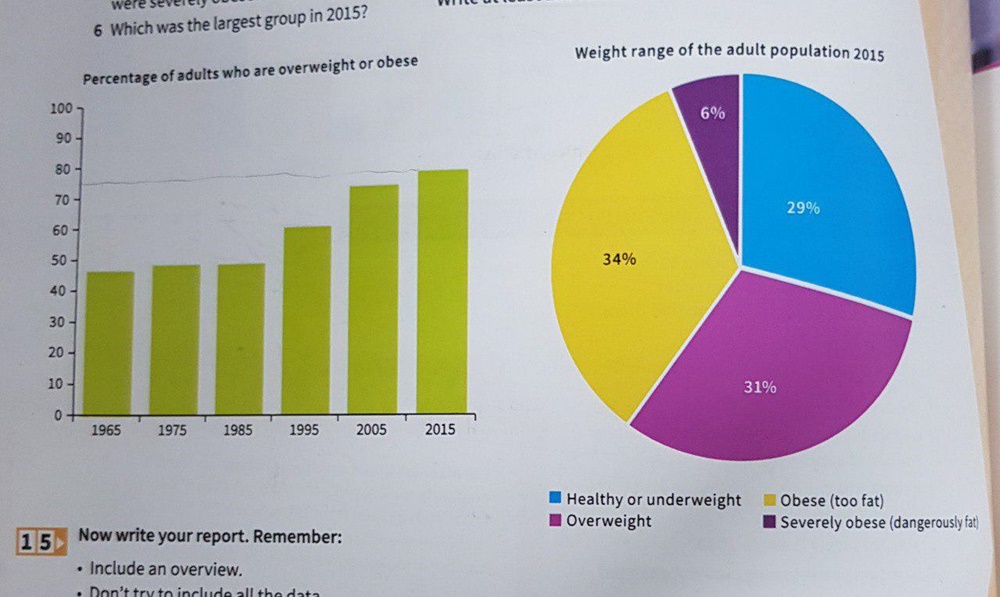
The pie chart demonstrates weight range of the adult population in 2015, while the bar chart shows how many adults are overweight or obese. We can see that over 60% of adults are overweighted or too fat and this number grew over time.
The bar chart starts from 1965 to 2015. The graph has remained stable until the end of the 90th and starts to grow drastically after that. As it shown 30% grow to happen in just 50 years.
The pie chart has 4 different category which is about 30% for each cluster except one that stood for severely fat adults. The adults who were dangerously fat account for 6% of the whole population .the sum of overweight people and obese adult is 65% witch in comparison to healthy people has a bigger part of the chart.
Top answer
This is not good writing. You need to write logically and carefully. Write very simple sentences when you are learning to write Task 1.
- This is not good writing.
- You need to write logically and carefully.
- Write very simple sentences when you are learning to write Task 1.
- It is very challenging.
- As you practice more, you can write longer sentences.
Get the Weekly English Kit 📬
New words, one handy idiom, and a 2-minute quiz — delivered to your inbox to keep your streak alive.
This is not good writing. You need to write logically and carefully.
Write very simple sentences when you are learning to write Task 1. It is very challenging. As you practice more, you can write longer sentences.
The pie chart demonstrates (wrong word) weight range of the adult population in 2015, while the bar char
 Related Questions