
IELTS Task 1 Writing
Hi
Please review this essay for me.
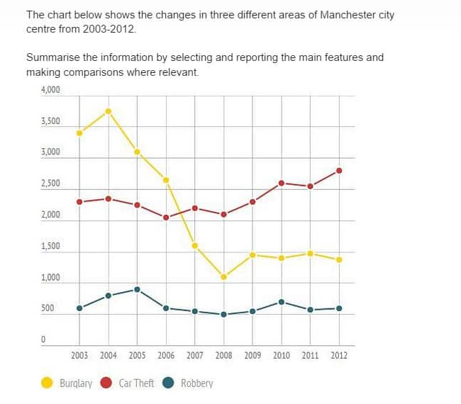
The line graphs compare the incidents of robbery, car theft, and burglary in Manchester city center from 2003 to 2012.
Overall, burglary incidents were the highest in the city in the initial years but they dropped below those of car theft in 2012. Robbery incidents were the least of the three in the entire period.
In detail, from 2003 to 2012, while there were around 20, 000 incidents of burglary, there were 23,000 incidents of car theft. Incidents of burglary from a little less than 3500 in 2003, reached 3800 in 2004. However, it gradually reduced to 1000 in 2008 before a slight increase the following year. In 2012, it was a little less than 1500. And, as for the car robbery, from around 2300 incidents in 2003, without any significant increase or decrease till 2009 it reached 2800 in 2012. Additionally, robbery incidents which were a little over 500 in 2003 touched almost 1000 in 2005 and remained around 500 the entire remaining period.
Top answer
The instructions make no sense. g. the central business district, the inner city residential area, and the suburbs.
- The instructions make no sense.
- g.
- the central business district, the inner city residential area, and the suburbs.
- It is not a chart.
- There are different types of charts: - pie chart - bar chart - flow chart - organization chart - eye chart - Gantt chart But this is not any of those!
Get the Weekly English Kit 📬
New words, one handy idiom, and a 2-minute quiz — delivered to your inbox to keep your streak alive.
The instructions make no sense.
Area of a city would refer to e.g. the central business district, the inner city residential area, and the suburbs.
It is not a chart.
There are different types of charts:
- pie chart
- bar chart
- flow chart
- organization chart
- eye chart
- Gantt chart
But this is not any of those!
The line graphs compare the incidents of robbery, car theft, and burglary in Manchester city center from 2003 to 2012.
Overall, burglary incidents were the highest in the city in the initial years but they dropped below those of car theft in 2012. Robbery incidents were the least
 Related Questions