
IELTS Task 1 (two bar charts)
You should spend about 20 minutes on this task.
The bar charts below show the percentages of men and women in employment in three countries in 2005 and 2015.
Summarise the information by selecting and reporting the main features, and make comparisons where relevant.
Write at least 150 words.
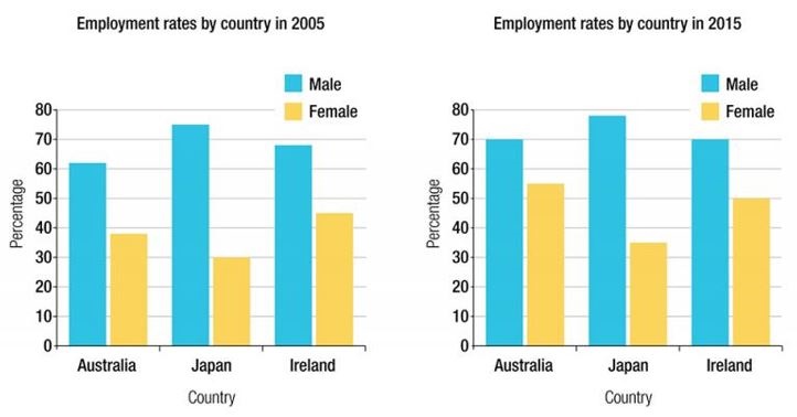
The bar charts show the proportion of men and women who are employed in three countries: Australia, Japan, and Ireland. The data are given for the years 2005 and 2015.
Overall, all the percentages increased between 2005 and 2015 and the percentage of employed men are larger than women in all three countries and two years.
Although all proportion increased, the percentage of women in employment in Australia had a significant change (38% to 54%) between 2005 and 2015. This led to the fact that, in 2005, Ireland had the largest proportion for females employment with 44% among the three countries, but in 2015 Australia was in the first place in this ranking.
In total contrast to women’s employment, Japan had the greatest employment rate for men in both years with 74% and 78% for the years 2005 and 2015 respectively. Japan was followed by Ireland and Australia in both years. These two countries were tied in second place in 2015 both with 70% male employment.
Get the Weekly English Kit 📬
New words, one handy idiom, and a 2-minute quiz — delivered to your inbox to keep your streak alive.
 Related Questions