
IELTS-TASK 1: The use of energy in Australia (1980-2030)
Question: The graph below gives information from a report in 2010 about the use of energy in Australia since 1980 with projections until 2030
Answer:
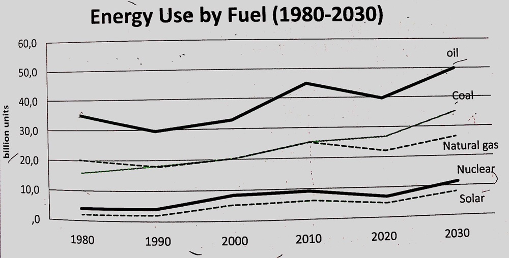
The line graph presents the expenditure of the five energy sources such as oil, coal, natural gas, nuclear and solar from 1980 to 2030.
Overall, there is an upward trend in the use of the energy from these sources. In addition, the number of oil used is the highest in Australia compared to the others, while some sources of renewable energy such as nuclear and solar are expended uncommonly.
In 1980, oil consumption in energy was approximately 35 billion units. By 2010, it increases by roughly 10 billion units and reaches a peak of 45 billion units. Over a next twenty-year period, it is forecasted to rise moderately to 50 billion units.
For coal and natural gas, starting at about 20 and 15 billion units respectively in 1980. By 2010, they are expended about 25 billion units. The expenditure of coal is projected to increase by 10 billion units whereas for natural gas, it will just rise by 5 billion units in 2030.
The minor energy sources were nuclear and solar. From 1980 to 2010, the consumption of the both rose slightly from about 4 billion unit to roughly 7 billion units. They are expected to rise relatively slightly to about 10 billion unit by 2030.
Top answer
) oil, coal, natural gas, nuclear and solar from 1980 to 2030. (Your paragraph is not complete. ) Overall, there is an upward trend in the use of the energy from these sources.
- ) oil, coal, natural gas, nuclear and solar from 1980 to 2030.
- (Your paragraph is not complete.
- ) Overall, there is an upward trend in the use of the energy from these sources.
- In addition, the number of oil (Oil, water, gas and other liquids are non-count.
- ) used is the highest in Australia (Wrong expression.
Get the Weekly English Kit 📬
New words, one handy idiom, and a 2-minute quiz — delivered to your inbox to keep your streak alive.
The line graph presents the expenditure (wrong word - expenditure is spending money.) of the five energy sources: such as (You gave an exact list, not a few examples.) oil, coal, natural gas, nuclear and solar from 1980 to 2030. (Your paragraph is not complete. You did not mention the geographic area or the units of mea
 Related Questions