
IELTS task 1 PLEASE REVIEW MY ESSAY
The first chart below shows how energy is used in an average Australian household. The second chart shows the greenhouse gas emissions which result from this energy use.
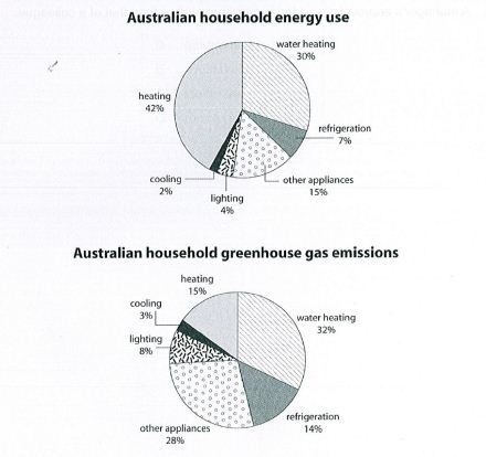
The first pie chart gives the percentages of energy used by Australian households. The second chart compared the greenhouse gas emission which results from this energy use.
Overall, in the first chart, a clear majority accounts for heating, while cooling only contributes a negligible share. The data also indicate that water heating dominates in the second chart, whereas the figures for cooling is the least impressive.
Accounting for 42% of the overall energy used, the heating had the largest proportion compared to the others. The subsequent ranks belong to the figures for water heating and other appliances. The first one constitutes 30%, which is 15 percentage points higher than the statistics for the second. Only 7%,4%,2% were the proportion of refrigeration, lighting, cooling.
Regarding Australian household greenhouse gas emissions, the chart recorded a proportion of 32% in water heating, which had the largest proportion compared to the others. It was followed by that of other appliances and heating. While the former made up 28%, the latter was only 13% less. Only 14%, 8%, 3% were the percentage of refrigeration, lighting, cooling.
Top answer
You do not understand how to properly write a series of elements. A conjunction must be inserted before the last element. For example: A, B, C and D.
- You do not understand how to properly write a series of elements.
- A conjunction must be inserted before the last element.
- For example: A, B, C and D.
- 3%, 9%, 1% and 2%.
- kings, queens, knights, bishops and pawns.
Get the Weekly English Kit 📬
New words, one handy idiom, and a 2-minute quiz — delivered to your inbox to keep your streak alive.
You do not understand how to properly write a series of elements. A conjunction must be inserted before the last element.
For example:
A, B, C and D.
3%, 9%, 1% and 2%.
kings, queens, knights, bishops and pawns.
red, green, blue
 Related Questions