
IELTS task 1. Please help me to check it. Thanks a lot.
Topic: The graph below shows the consumption of fish and some different kinds of meat in a European country between 1979 and 2004.
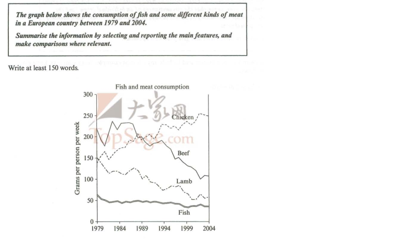
The line chart illustrates how chicken, beef, lamb and fish are used in a western country from 1979 to 2004.
Overall, it can be seen that chicken had an upward trend most while beef had a downward trend best over the period of 25 years.
Starting at over 200 grams in 1979, the amount of beef decreased suddenly but it increased again afterward. These kind of meat saw a significant fall to approximately 100 grams in the last year. On the other hand, the amount of fish stayed stable over the whole time with roughly 50 grams.
In 1979, the figures for both chicken and lamb the same value at 150 grams. From 1979 to 2004, the amount of chicken witnessed a gradual rise and reached a peak at 250 grams in the final year. Meanwhile, the opposite was true for lamb with a continual decrease to roughly 60 grams in 2004.
Top answer
The line chart (wrong noun. ) illustrates how chicken, beef, lamb and fish are used (Incorrect verb. We use a cell phone.
- The line chart (wrong noun.
- ) illustrates how chicken, beef, lamb and fish are used (Incorrect verb.
- We use a cell phone.
- We use tools.
- ) in a western country from 1979 to 2004.
Get the Weekly English Kit 📬
New words, one handy idiom, and a 2-minute quiz — delivered to your inbox to keep your streak alive.
The line chart (wrong noun. Charts are pie charts and bar charts.) illustrates how chicken, beef, lamb and fish are used (Incorrect verb. We use a cell phone. We use tools. We use pencils and pens to write.) in a western country from 1979 to 2004. (Your description is not complet
 Related Questions