
IELTS task 1. Please check my grammar please!
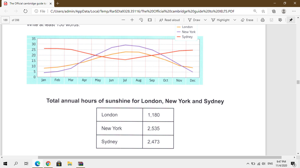
The graph and table below show the average monthly temperature and the average number of hours of sunshine per year in three major cities.
---------------------------------------------------------------
My essay:
The line graph compares the average temperatures in a year of three cities: London, New York, and Sydney, measured in degree. Furthermore, the table gives the total number of annual sunshine hours in these places.
Overall, there is a significant gap between the monthly temperature of Sydney with other cities. However, the total hours of sunshine in New York are higher than in Sydney and London.
In the line graph, Sydney ranked first when having the highest temperature in January, at 25, which is followed by London (around 7), and New York (4 approximately). However, despite reaching their peaks at 30 and nearly 23 respectively in July, the rankings of New York and London in December remained the same, which are at 5 and 10 in order. The temperature of Sydney increased again to 25 after dropping to the bottom at approximate 16 in July.
In the table, London has the fewest number of sunshine hours, at 1180, which created a huge difference with the second-ranking, Sydney, at 2473. There are 62 more hours in New York than in Sydney, at 2535.
Top answer
The line graph compares the average temperatures in a year (That is incorrect. The average temperature in a year is one number for each city. ) of three cities: London, New York, and Sydney, measured in degree .
- The line graph compares the average temperatures in a year (That is incorrect.
- The average temperature in a year is one number for each city.
- ) of three cities: London, New York, and Sydney, measured in degree .
- (There are two problems with this one word.
- First, it is the wrong word.
Get the Weekly English Kit 📬
New words, one handy idiom, and a 2-minute quiz — delivered to your inbox to keep your streak alive.
The line graph compares the average temperatures in a year (That is incorrect. The average temperature in a year is one number for each city. ) of three cities: London, New York, and Sydney, measured in degree. (There are two problems with this one word. First, it is the wrong word. Degree m
 Related Questions