
IELTS task 1 PLEASE CHECK MY ESSAY
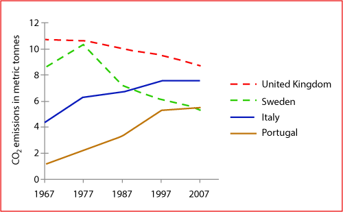
The graph below shows average carbon dioxide (CO2) emissions per person in the UK, Sweden, Italy and Portugal between 1967 and 2007.
Summarize the information by selecting and reporting the main features, and make comparisons where relevant.
The graph shows how much carbon dioxide a person released during 40 years from 1967 to 2007.
Overall, the amount of CO2 in the United Kingdom and Sweden suffered a significant decrease throughout the period. Whereas, the period brought a substantial increase to the amount of CO2 in Italy and Portugal.
It is can be seen that there were striking similarities between the amount of Co2 in the UK and Sweden. Standing at less than 11 metric tons in 1967, before dropping to nearly 9 metric tones in 2007 in the UK. Notably, there was a considerable increase from more than 8 to almost 11 metric tons, which ended up at 5 metric tons in 2007 in Sweden.
Meanwhile, it comes into attention that both the remainders follow similar trend throughout the period. Particular, standing at more than 4 metric tons in 1967, the amount of Co2 in Italy saw a dramatic rise by 3 metric tons from this time onwards. Simultaneously, the amount Co2 of Portugal which was released was lowest at more than 1 metric tons per person. Then, the remaining period brought a tremendous growth of nearly 5 metric tons to the amount of Co2 in 2007.
Top answer
You have made a good try at this challenging task. But there are many problems with your essay. They are very common problems for new writers.
- You have made a good try at this challenging task.
- But there are many problems with your essay.
- They are very common problems for new writers.
- You need to be more careful and precise.
- Describe the figure precisely and exactly, without emotional words Learn vocabulary words appropriate for math and science writing.
Get the Weekly English Kit 📬
New words, one handy idiom, and a 2-minute quiz — delivered to your inbox to keep your streak alive.
You have made a good try at this challenging task. But there are many problems with your essay. They are very common problems for new writers.
You need to be more careful and precise. Describe the figure precisely and exactly, without emotional words Learn vocabulary words appropriate for math and science writing. They are quite different from words you use to argue your opinion (Task 2
Here is a gap-fill exercise for line graphs and the task 1 report. It has lists of words you should use for line graphs.
 Related Questions