
IELTS TASK 1: Pie chart
The charts below show the reasons why people travel to work by bicycle or by car. Summarise the information by selecting and reporting the main features, and make comparisons where relevant.
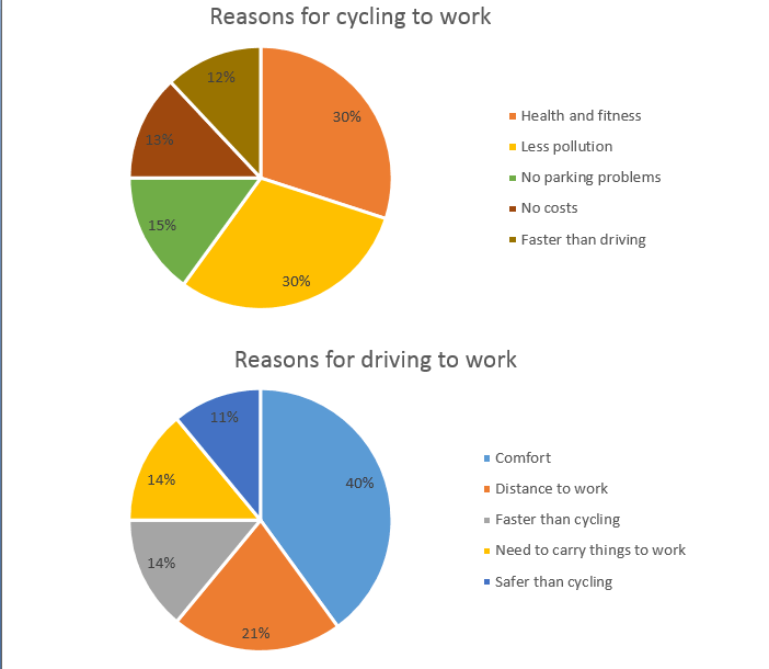
The two pie charts give us data about reasons why people choose a bicycle or a car to travel to work. There is some difference between the reasons behind the two choices.
For people who choose to cycle to work, 30 percent of them suppose that cycling helps them with better health and fitness. With the same percentage, reduction of pollutant emission to the environment is also the reason for riding the bicycle. Next, the rest reasons for this decision are about people not to worry about parking matters, cycling costs no fee and cycling is faster than driving. Each reason accounts for 15,13 and 12 percent of the chart, respectively.
For people who choose to drive to work, feeling comfortable is the most popular reason with 40 percent of people agree with this. This proportion falls by half for the reason that some people driving the car because of long distance between their home and workplace. To compare with people riding to work, people using the car suppose that driving is much faster than cycling and driving helps them to carry things to work. These two reasons have the same percentage at 14 percent. The last reason with the least percentage at 11 percent is that driving is safer than riding the bicycle.
Top answer
The two pie charts give us data about a breakdown of the reasons why people choose a bicycle or a car to travel to work. There is some difference between the reasons behind the two choices. (That sentence has no meaningful content.
- The two pie charts give us data about a breakdown of the reasons why people choose a bicycle or a car to travel to work.
- There is some difference between the reasons behind the two choices.
- (That sentence has no meaningful content.
- ) Your first paragraph is lacking some important information about the pie charts.
- I would include these points.
Get the Weekly English Kit 📬
New words, one handy idiom, and a 2-minute quiz — delivered to your inbox to keep your streak alive.
The two pie charts give us data about a breakdown of the reasons why people choose a bicycle or a car to travel to work. There is some difference between the reasons behind the two choices. (That sentence has no meaningful content. The more astonishing observation would be that there is no difference at all!)
 Related Questions