
IELTS Task 1 - Percentage of tourists to different locations in Brighton
The line graph below shows the percentage of tourists to England who visited four different attractions in Brighton.
Summarise the information by selecting and reporting the main features, and make comparisons where relevant.
The given line chart depicts how many tourists who paid a visit to Brighton attractions between 1980 to 2010. Noticeably, the pavilion was the attraction with the highest percentage of tourists in 2010, but it stayed behind the festival at the beginning.
There was an upward trend in terms of visitors to pavilion and pier in the period shown. However, while the number of tourists who visited pavilion rose considerably and then peaked at almost 50% in 1995, pier only reached its highest point in 1985 at nearly 15%, then its figure increased until it garnered above 20% of tourists.
By contrast, the figure for art gallery started stronger than that for the pier with more than 20% of travellers visiting this attraction. However, unlike pavilion, the percentage of tourists who visited art exhibits soared to nearly 40% in 1985, before dramatically declined in the following years. In 2010, art gallery only managed to attract less than half of that amount and became the lowest-ranked attraction in the chart. Likewise, there was a downward trend regarding the number of visitors to festivals in Brighton, which eventually managed to stay below 30% in 2010.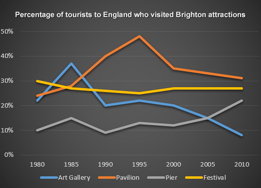
Top answer
Please read my advice for Task 1 essays. You make the typical errors of structure and vocabulary. IELTS TASK 1: Hints, Tips And Advice Vocabulary Words For Task 1: Reference Post The given line chart (wrong word.
- Please read my advice for Task 1 essays.
- You make the typical errors of structure and vocabulary.
- IELTS TASK 1: Hints, Tips And Advice Vocabulary Words For Task 1: Reference Post The given line chart (wrong word.
- ) depicts how many (incorrect.
- g.
Get the Weekly English Kit 📬
New words, one handy idiom, and a 2-minute quiz — delivered to your inbox to keep your streak alive.
Please read my advice for Task 1 essays. You make the typical errors of structure and vocabulary.
 Related Questions