
IELTS task 1 (LINE )
The chart illustrates changes in the number of immigration, emigration and net migration in the UK from 1999 to 2008.
Overall, it can be clearly seen that there was an upward trend in the number of international migration in the UK over the 10-year period. Besides, the number of migration increased considerably after 2003.
According to the chart, although there were minor fluctuations in the number of international immigration and emigration, it went up between 1999 and 2008. To be more specific, the figure for immigration rose from about 450000 in 1999 to nearly 600000 in 2008, and it peaked at 600000 in the year 2006. With regard to the figure for emigration, there were 300000 people emigrated from the UK in 1999 and over 400000 people left the UK in the last year of the period.
At the same time, the net migration figure remained stable from the first five years (1999~2003), around 150000. By contrast, more and more people migrated from the UK after 2003, the number of people migrating reached the highest point in the year 2004.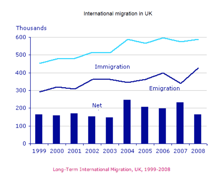
Top answer
The chart (not precise enough, incorrect label) illustrates (poor word choice, an illustration is a drawing) changes in the number of immigration, emigration and net migration (wrong expression) in the UK from 1999 to 2008. Model opening paragraph: The figure, consisting of a line graph and bar chart, gives data on migration for the UK between 1999 and 2008. The line graph plots the numbers of immigrants and emigrants in thousands, and the bar chart shows the net migration of people totalled for each year.
- The chart (not precise enough, incorrect label) illustrates (poor word choice, an illustration is a drawing) changes in the number of immigration, emigration and net migration (wrong expression) in the UK from 1999 to 2008.
- Model opening paragraph: The figure, consisting of a line graph and bar chart, gives data on migration for the UK between 1999 and 2008.
- The line graph plots the numbers of immigrants and emigrants in thousands, and the bar chart shows the net migration of people totalled for each year.
- Overall, it can be clearly seen that (These words are superfluous.
- They do not describe the data.
Get the Weekly English Kit 📬
New words, one handy idiom, and a 2-minute quiz — delivered to your inbox to keep your streak alive.
The chart (not precise enough, incorrect label) illustrates (poor word choice, an illustration is a drawing) changes in the number of immigration, emigration and net migration (wrong expression) in the UK from 1999 to 2008.
 Related Questions