
IELTS task 1 - Consumption of fast food by Australian teenager
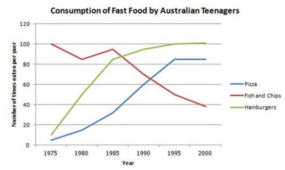
The line graph depicts a comparison between the consumption of three categories of fast food eaten by Australian teenagers over 25 year period from 1975 to 2000. In general, there was a gradual fall in consuming fish and chips while pizza and hamburgers had an opposite trend.
As the graph shows, the amount of fish and chips peaked at 100 times per year in 1975. Then, there was a fluctuation during period from 1975 to 1985 before standing at about 95 times. Following this, the need for fish and chips significantly decreased to a low of nearly 40 times in 2000.
By contrast, pizza and hamburgers became more popular and their expenditure substantially went up. Looking at the details, pizza’s consumption risen steadily from about 2 times in 1975 to over 80 times in 1995, though its figure leveled off from 1995 to 2000. Likewise, there was a considerable increase of hamburgers’ rate from 5 times to approximately 83 times. This rise was noticeable between 1975 and 1985 but the growth slowed during the remaining period.
Top answer
The line graph depicts a comparison between the consumption of three categories of fast food eaten by Australian teenagers over 25 year period from 1975 to 2000. In general, there was a gradual fall in consuming fish and chips (the consumption of fish and chips) while pizza and hamburgers had an opposite trend. The measure was the average number of meals per year when the food was eaten.
- The line graph depicts a comparison between the consumption of three categories of fast food eaten by Australian teenagers over 25 year period from 1975 to 2000.
- In general, there was a gradual fall in consuming fish and chips (the consumption of fish and chips) while pizza and hamburgers had an opposite trend.
- The measure was the average number of meals per year when the food was eaten.
- (If you define the measurement units first, then you can just give the values when you describe the details.
- ) As the graph shows, the consumption amount of fish and chips peaked at 100 times per year in 1975.
Get the Weekly English Kit 📬
New words, one handy idiom, and a 2-minute quiz — delivered to your inbox to keep your streak alive.
The line graph depicts a comparison between the consumption of three categories of fast food eaten by Australian teenagers over 25 year period from 1975 to 2000. In general, there was a gradual fall in consuming fish and chips (the consumption of fish and chips) while pizza and hamburgers had an opposite trend. The measure was the averag
The line graph depicts a comparison between the consumption of three categories of fast food eaten by Australian teenagers over a 25-year period from 1975 to 2000. In general, there was a gradual fall in the consumption of ing fish and chips whi
The process diagram provides information about amount and type of junk food consumed by Australian students from 1975 to 2000.
Overall,what stands out from the graph is that there were significant upward trends in the amount of both Pizza and Hamburgers,while the amount of Fish and Chips saw a considerable fall over the period.
Looking at the details,as regards Pizza,num
 Related Questions