
IELTS TASK 1 - BAR CHART - Please Check This Summary
The bar chart shows the number of cars per 1000 people in 5 countries in Europe in 2005, 2009 and 2015, compared with the European average.
Summarise the information and make comparisons where relevant.
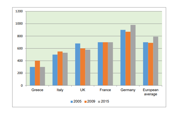
The chart illustrates how many cars were owned per 1000 of the population in five European countries in three different years. The figures for the European average are also given.
Overall, it is clear that the figures for car ownership in Greece were lower than those in other countries. In contrast, car ownership in Germany was higher than the European average.
There was an increase in the number of cars owned in Greece from 300 per 1000 of the population in 2005 to 400 in 2009, before decreasing to 300 again in 2015. Car ownership in Italy saw a similar trend, reaching a peak of 580 in 2009. However, in the UK the number of cars fell over the period from 680 per 1000 people in 2005 to 580 in 2015.
While the number of cars owned per 1000 people remained constant in France, at 700, in Germany the figures were much higher than the European average. In 2005, the figure was 900, and this fell slightly before rising to 980 in 2015. The average in Europe increased over the period, from 700 in 2005 to 790 ten years later.
Top answer
car banana 513 per 1000 of the population 1000 -> thousand. Write single word numbers out in full. Modern style is to write "per thousand population".
- car banana 513 per 1000 of the population 1000 -> thousand.
- Write single word numbers out in full.
- Modern style is to write "per thousand population".
- t1%3B%2Cper%20thousand%20population%3B%2Cc0 car banana 513 in five European countries Might as well list them here to make the scope clear.
- car banana 513 in three different years.
Get the Weekly English Kit 📬
New words, one handy idiom, and a 2-minute quiz — delivered to your inbox to keep your streak alive.
car banana 513per 1000 of the population
1000 -> thousand. Write single word numbers out in full.
Modern style is to write "per thousand population".
Correction: The rate of car ownership in Germany was 900 per thousand people.
The chart does not of course imply that "ninety per cent owned a car. "
 Related Questions