
Ielts task 1. bar chart
Please review my essay and suggest some useful words or phrases for bar chart !!!. Thanks in advance
The bar chart below illustrates five different industries’ percentage share of Country B’s economy in 1995 and 2015 with a forecast for 2025.
Summaries the information by selecting and reporting the main features, and make comparisons where relevant.
Write at least 150 words.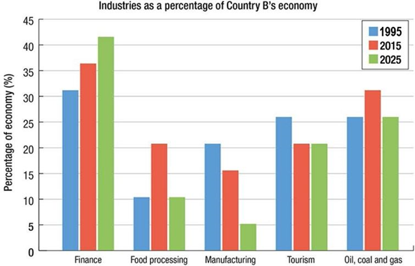
The diagram depicts information regarding the proportions of which five distinguished industries accounted for the country’s B economy in 1995 and 2015 as well as a projection for 2025. Overall, it is clearly apparent that the financial industry has taken the lion’s share of the country’s economy with consistent rises, whilst others are foreseen to be on the decrease in 2025.
Starting at about 30 percent in 1995, the financial industry’s figures rose exponentially by approximately 15 percent after a decade. The figures are predicted to continue its growth and peak at nearly 43 percent in 2025. By contrast, the manufacturing industry’s statistics plummeted continuously over the time and are projected to keep that trend in the future. During 1995, the tourism industry’s percentage accounted for nearly 25 percent, nonetheless, its figures plunged by 5 percent and are foreseen to remain stable in the future.
Concerning the food processing industry and oil, coal and gas industry, these organizations have shared a similar trend from the past to the future. In 1995, both figures were about 10 percent and 20 percent correspondingly. After a decade, that of the processing industry doubled while the oil, coal and gas industry’s percentage increased slightly. Nevertheless, both figures are forecast to reverse to its starting level in 2025.
Top answer
Dear Hong Nhat Tan; Where did you get this impossible bar chart? Do not write about graphs or charts that have impossibly bogus information. I refuse to review any such essays.
- Dear Hong Nhat Tan; Where did you get this impossible bar chart?
- Do not write about graphs or charts that have impossibly bogus information.
- I refuse to review any such essays.
- However, you can benefit from my advice on Task 1 essays.
- Choose a task 1 practice essay from a reputable website.
Get the Weekly English Kit 📬
New words, one handy idiom, and a 2-minute quiz — delivered to your inbox to keep your streak alive.
Dear Hong Nhat Tan;
Where did you get this impossible bar chart? Do not write about graphs or charts that have impossibly bogus information. I refuse to review any such essays.
However, you can benefit from my advice on Task 1 essays. Choose a task 1 practice essay from a reputable website.
I will highlight the text that is poor English. Your main problem is that you describe three data points, twenty and ten years apart, as if it was a continuous line graph. You cannot see what happened in between these specific years, so words like "continuous, exponential, and stable" are inappropriate. The other inappropriate word choices are described in my advice which I linked earlier.
 Related Questions