
Ielts task 1 bar chart
The bar chart below gives information about the percentage of the population living in urban areas in the world and in different continents.
Summarise the information by selecting and reporting the main features, and make comparisons where relevant.
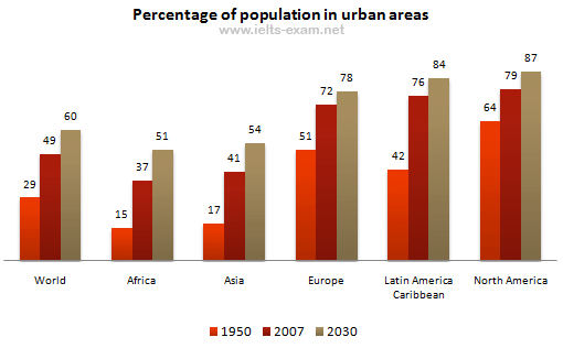
The bar chart represents the proportion of population settling in urban regions of different continents in 1950 and compares to that in 2007. In addition, it makes conjecture percentage in 2030.
In general, there is a dramatic increase in the percentage of urban population between 1950 and 2007 and that is predicted to have an upward trend in 2030. It is clear that Africa and Asia made up lower proportion than that of the world while the others had the bulk of the population in their urban areas.
As can be seen, Asia and Africa had a similar percentage and tendency. In Africa, the percentage of urban population sharply rose from 15% to 37%, compares to that in Asia which augmented for 17% and 41% in 1950 and 2007 respectively. Besides, the projection for 2030 indicates above a half of people in their continents will reside in urban areas.
In contrast, the other continents accounted for a higher percentage than the average level of the world. In detail, 42%, 51% and 64% of Europe, Latin America Caribbean and North America respectively while the world just attained 29% in 1950. In the next 57 years, three-fourths of their population lived in urban areas and those are forecast to reach approximately 80% urban population, higher 20% than that percentage of the world.
Top answer
The bar chart below gives information about the percentage of the population living in urban areas in the world and in different continents. Summarise the information by selecting and reporting the main features, and make comparisons where relevant. e.
- The bar chart below gives information about the percentage of the population living in urban areas in the world and in different continents.
- Summarise the information by selecting and reporting the main features, and make comparisons where relevant.
- e.
- "the proportion") to that in 2007.
- In addition, it makes conjecture percentage (wrong phrase and wrong usage.
Get the Weekly English Kit 📬
New words, one handy idiom, and a 2-minute quiz — delivered to your inbox to keep your streak alive.
The bar chart below gives information about the percentage of the population living in urban areas in the world and in different continents.
Summarise the information by selecting and reporting the main features, and make comparisons where relevant.
The bar chart presents represents
 Related Questions