
IELTS TASK 1
Writing task 1
You should spend about 20 minutes on this task.
The chart shows the unemployment situation in Australia in the year 2012.
Summarize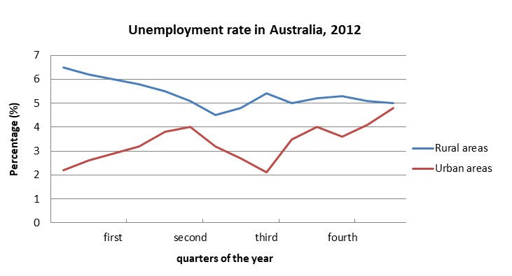
the information by selecting and reporting the main features, and make comparisons where relevant.
You should write at least 150 words.
My answer :-
The following line chart illustrates the rate of unemployment in Australia in percentages over four quarters of the year.
The data from the the chart shows that the unemployability among the rural and urban areas of Australia had a stark amount of difference between them with rural areas having a higher amount of unemployed people than the urban areas however both the areas after fluctuations throughout the time period have reached a very similar rate of unemployability.
The rural areas began with a high percentage of almost 7% in the first quarter but then decreases from first to the second quarter reaching just below 5% but then at the end reaches 5%. The urban area starts with a 2% but then doubles from the first to the second quarter before falling back to the same rate. during the third to the fourth quarter however, it increased by 2% yet again with a drop in between before reaching a percentage near 5%.
Get the Weekly English Kit 📬
New words, one handy idiom, and a 2-minute quiz — delivered to your inbox to keep your streak alive.
 Related Questions