
IELTS task 1
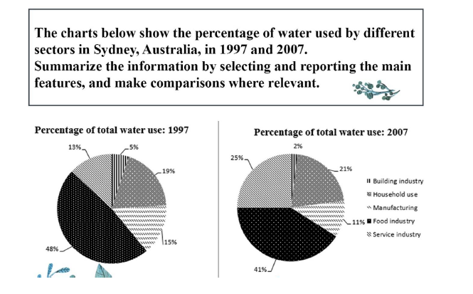
The charts compare the proportions of water usage in five different sectors in Sydney, Australia, in 1997 and 2007.
Overall, in both years, the amount of water used in the food industry and the building industry respectively accounted for the highest and lowest percentage among the five sectors. It is also noticeable that there was a significant increase in the use of water for the service domain.
The percentage of water used for services raised by double, from 13% in 1997 to 25% in 2007. That in food industry, meanwhile, also slightly increased from 19% to 21% of the total.
In contrast, there was a small decline in water usage in other sectors namely the food industry, the household industry, and the manufacturing. In 1997, these sectors respectively made up 48, 15, and 5 percent of the total consumption. After 10 years, these numbers fell to 41, 11, and 2 percent.
Top answer
You barely wrote the minimum number of words. It is better to aim for 170-190 words to be safe and not lose points. The charts (What kind of charts?
- You barely wrote the minimum number of words.
- It is better to aim for 170-190 words to be safe and not lose points.
- The charts (What kind of charts?
- Stacked bar charts?
- ) compare the proportions of water usage in five different sectors in Sydney, Australia, in 1997 and 2007.
Get the Weekly English Kit 📬
New words, one handy idiom, and a 2-minute quiz — delivered to your inbox to keep your streak alive.
You barely wrote the minimum number of words. It is better to aim for 170-190 words to be safe and not lose points.
The charts (What kind of charts? Stacked bar charts? How many are there?) compare the proportions of water usage in five different sectors in Sydney, Australia, in 1997 and 2007. (What are the sectors shown? Your first paragraph is not adequately descr
 Related Questions