
IELTS Essay: Australian Residents
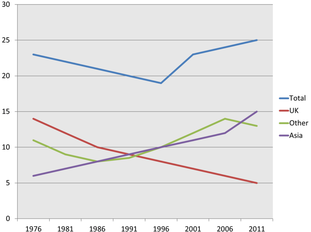
The line chart compares the number of people from three different countries: the UK, Asia and others living in Australia from 1976 to 2011.
In general, more people from all categories were living in Australia over the period with the notable exception of the UK which experienced a steep decline.
Individuals from the UK were always more than the other demographics for more than a decade, but it was then overtaken by Asian people in 1991 as the population for these two groups was exactly the same at approximately 9 million. The UK experienced the biggest overall decrease from the highest point in 1976 at nearly 14 million to only 5 million in 2011. By contrast, Asian residents grew the most, from the smallest population at 6 million to triple that of the UK at the end of the period (15 million).
The rise in other nationalities was more moderate with initial and final figures at 11 million and 13 respectively. More specifically, there was a constant increase in population for this category apart from two dropping trends in the first decade by 3 million and the last 5 years by 1 million. Total numbers remained between 19 and 25 million throughout the period with a low point in 1996 and a peak in 2011.
Top answer
This is your fifth Task 1 essay posted today. It is not a good way to learn. Read the feedback on each essay and use that feedback to revise the essay.
- This is your fifth Task 1 essay posted today.
- It is not a good way to learn.
- Read the feedback on each essay and use that feedback to revise the essay.
- IF you do not understand, ask questions, or ask for a sample to study.
- After you have a satisfactory revision, you can then go to the next essay, and consider the feedback on that one.
Get the Weekly English Kit 📬
New words, one handy idiom, and a 2-minute quiz — delivered to your inbox to keep your streak alive.
This is your fifth Task 1 essay posted today. It is not a good way to learn.
Read the feedback on each essay and use that feedback to revise the essay. IF you do not understand, ask questions, or ask for a sample to study.
After you have a satisfactory revision, you can then go to the next essay, and consider the feedback on that one.
Otherwise, you will just keep making the
 Related Questions