
IELTS Academic Writing Task 1- Line Graph
The line graph below shows changes in the amount and type of fast food consumed by Australian teenager from 1975 to 2000
Summarise the information by selecting and reporting the main features and make comparisons where relevant.
» Write at least 150 words.
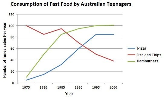
The given line graph illustrates how much three different kinds of fast food namely pizza, fish and chips, hamburgers were consumed by Australian adolescents over the period of 25 years, starting in 1975.
Overall, it is evident that the amount of pizza and hamburgers consumed recorded upturns, while the opposite pattern was witnessed in that of fish and chips. Also, the figure for hamburgers consumed experienced the greatest difference.
At the beginning of the period, the amount of hamburgers eaten started at 10 times per year which was twice that of pizza. The consumption of both these foods increased significantly until 1995. Five years after, while the consumption of pizza remained unchanged, that of hamburgers rose slightly and reached a peak at more than 100 times consumed per year.
With regards to the consumption of fish and chips. With 100 times consumed per year, fish and chips was the most eaten among three foods mentioned at the beginning of the period. However, this figure decreased to more than 80 times in the next five years. This figure continued to decrease significantly until 2000 after increasing slightly in 1985.
WRITE DESCRIPTION HERE
Top answer
Double post. htm Thread closed.
- Double post.
- htm Thread closed.
Get the Weekly English Kit 📬
New words, one handy idiom, and a 2-minute quiz — delivered to your inbox to keep your streak alive.
 Related Questions