
IELST TASK 1 writing. can you give me some feedback.??
The graph below shows the percentage of people in different age groups in one city who attended music concerts between 2010 and 2015.
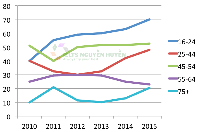
The line chart illustrates the proportion of people in five different countries who took part in music concerts in one city from 2010 to 2015.
Overall, the 16 to 24-year-olds group had the greatest change, while the opposite was true for both people aged 45 to 54 and 55 to 64.
In 2010, people aged 45 to 54 years old who went to music concerts stood at 51%, before dropping to 40% in 2011 and rising to 52% at the end of the period. The figures for both 16 to 24 and 25 to 44 age groups started at 40% in 2010. While the percentage of people aged 16 to 24 had an upward trend to 70% in 2015, the 25 to 44 age group's figure decreased to 30% in 2012 and climbed to 58% in 2015.
Starting at 25% in 2010, the proportion of people aged 55 to 64 years old who took part in music concerts decreased slightly to 22% in 2015. The figure for the over 75 years old group increased from 10% in 2010 to 22% in 2015. After four years, there was a fall significantly in people aged over 75 years old to 10% in 2013, before increasing to just over 22% in 2015.
Top answer
Please read my advice for Task 1 essays. Many of your errors are covered. IELTS TASK 1: Hints, Tips And Advice Vocabulary Words For Task 1: Reference Post
- Please read my advice for Task 1 essays.
- Many of your errors are covered.
- IELTS TASK 1: Hints, Tips And Advice Vocabulary Words For Task 1: Reference Post
Get the Weekly English Kit 📬
New words, one handy idiom, and a 2-minute quiz — delivered to your inbox to keep your streak alive.
Please read my advice for Task 1 essays. Many of your errors are covered.
The line chart (There are pie charts, bar charts, eye charts, flow charts, organization charts and Gantt charts, but there is no such thing as a line chart. Read my advice for names of these figures.) illustrates (Wrong word. Read my advice for verbs that go with plots.) the proportion
Sample essay:
The line graph plots the percentage of residents of a certain city who went to a music concert each year from 2010 to 2015. They are divided into six age brackets, the youngest (16-24), adults (25-44), middle-aged adults (45-54), older adults (55-64) and seniors (over 75). There is no data for people 65-74.
Overall, the younger the age group, the high
 Related Questions