
Hi teacher, i also have one essay, but i do not received reply from teacher , help me , thanks so much
Topic: : The line graph shows the number of people who used different communication services in the world. Units: per 100 inhabitants.
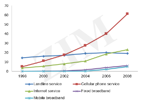
The line graph illustrates the amount of different communication services were used by people from 1998 to 2008 in the world.
Overall, there was a sharp increase in people used cellular phone service. In contrast, the number of people who used mobile broadband and fixed broadband saw similarly trend.
In 1998, the figure of people used cellular phone service started at over 10 inhabitants, and exceeded that of people used landline service at 20 inhabitants in 2002. This number rose significantly approximate 70 inhabitants in 2008. More over, there was a slight grow in people used internet service, and also capped in people used landline service at 20 inhabitants in 2006 whereas landline service used by people remained stable around at 20 inhabitants during 1998 and 2008.
At 0 inhabitants, the amount of people used mobile and fixed broadband in 2002. However, this amount saw an up ward trend, and was increasing at 8 inhabitants in 2008.
Top answer
The line graph illustrates the amount of different communication services that were used by people from 1998 to 2008 in the world. (That is not a good description of the line graph. It does not show the amount of services - for example minutes of cell-phone time.
- The line graph illustrates the amount of different communication services that were used by people from 1998 to 2008 in the world.
- (That is not a good description of the line graph.
- It does not show the amount of services - for example minutes of cell-phone time.
- Here is a better paraphrase, it you must paraphrase.
- Paraphrasing is not always a good thing to do.
Get the Weekly English Kit 📬
New words, one handy idiom, and a 2-minute quiz — delivered to your inbox to keep your streak alive.
The line graph illustrates the amount of different communication services that were used by people from 1998 to 2008 in the world. (That is not a good description of the line graph. It does not show the amount of services - for example minutes of cell-phone time. Here is a better paraphrase, it you must paraphrase. Paraphrasing is not always a goo
 Related Questions