
Help me with pie charts, please. Many thanks!
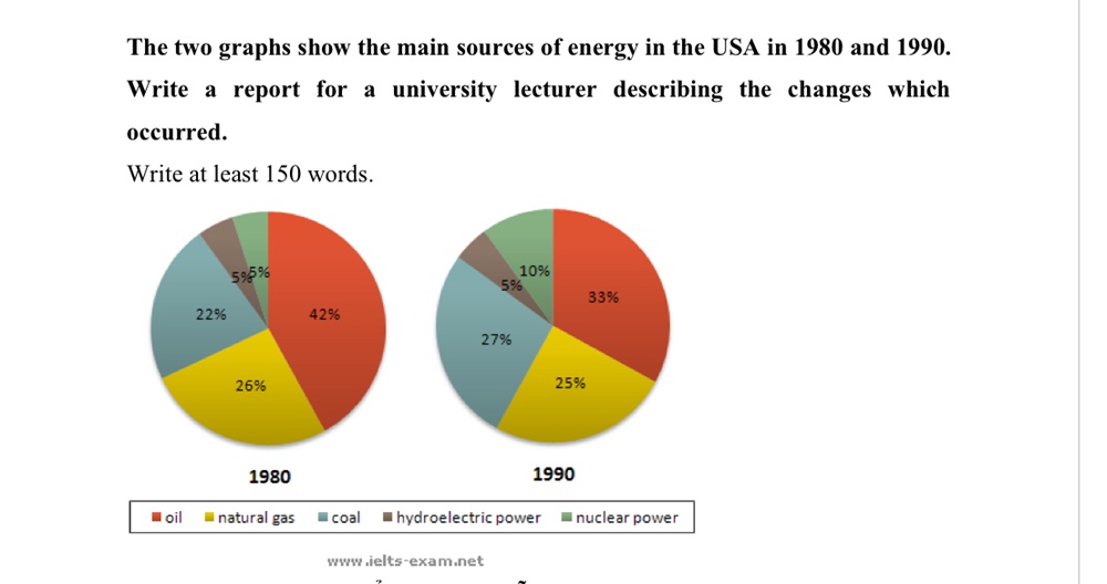
The two pie charts compare the primary sources of energy in the USA in 1980 and 1990. These sources are oil, natural gas, coal, nuclear and hydro.
Overall, there was an increase in coal and nuclear between 1980 and 1990, in contrast to the drop in the three remaining sources. The proportion of hydro had no change during the period shown. In both years, most energy was produced from oil.
In detail, the value for oil decreased substantially from 42% to 33%. Natural gas was stable with only a 1% drop. Nuclear was the same as hydro, at about 5% in 1980, but the ratio was 2:1, 10% for nuclear and 5% for hydro ten years later. In 1980, two sources (coal and hydro or nuclear) accounted for 27%, but by 2010, it was producing the same amount of energy from only one: coal. In 1990, coal was the secondary source due to an 5% incease in energy production.
Get the Weekly English Kit 📬
New words, one handy idiom, and a 2-minute quiz — delivered to your inbox to keep your streak alive.
 Related Questions