
Hello teacher, My name's Van. I am trying to achieve 6.5 scores IELTS test. could you help me check this writing task 1
The graph compares the amount of carbon dioxide released by per person in four different countries: UK, Sweden, Italy and Portugal from 1967 to 2007
It is clear that average CO2 emission per person in each country represents diverse changes. While Italy and Portugal have the amount of CO2 released dramatically increasing, that of other countries seems to be reduced tendency
During 40 years, average CO2 emission per Portuguese sharply goes up to 5 metric tons instead of only 1 metric tons in 1967. Likewise, Italy is seen to have the amount of average carbon dioxide released in each person considerably rising from 4 metric tons to nearly 8 metric tons in the end of period.
On the other hand, although starting at 8.5 metric tons, CO2 emission in UK is slightly decline to 5 metric tons. Whilst in per British releases up to 10.5 metric tons of CO2 in 1977 before falling down to over 5 metric tons in 2007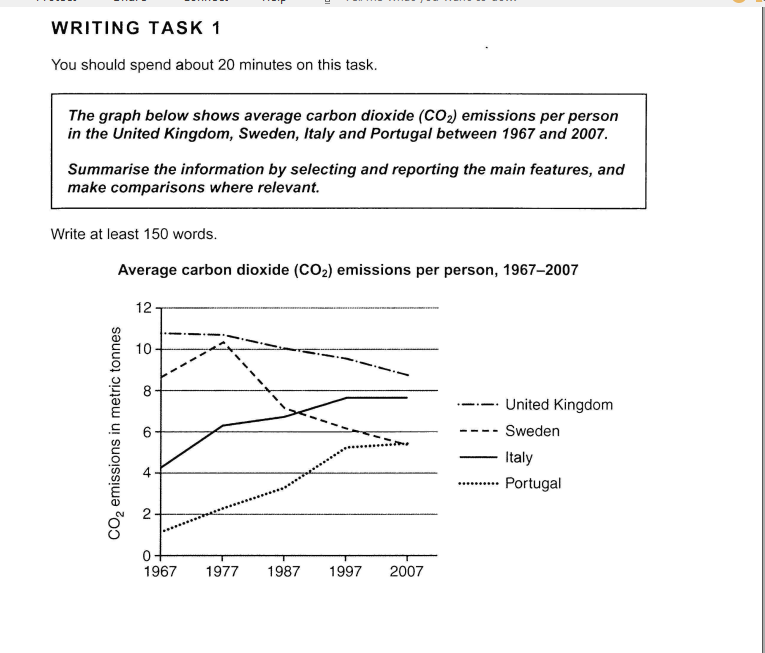
-Let's me know how to use this web after that, because I have already signed in by another account, however, its suddenly not working. do i have to pay fee for advices or something like that?
=Thank you so much and have a good day===
Top answer
Le Van however, it's suddenly not working. Do I have to pay fee for advice or something like that? The site is getting a facelift.
- Le Van however, it's suddenly not working.
- Do I have to pay fee for advice or something like that?
- The site is getting a facelift.
- The name is being changed from "EnglishForward" to "EnglishForward" and there will be some new features added.
- During this transition, there have been (and will be) several lapses of service as the developer team updates the website software.
Get the Weekly English Kit 📬
New words, one handy idiom, and a 2-minute quiz — delivered to your inbox to keep your streak alive.
Le Vanhowever, it's suddenly not working. Do I have to pay fee for advice or something like that?
The site is getting a facelift. The name is being changed from "EnglishForward" to "EnglishForward" and there will be
The graph compares the amount of carbon dioxide released by (wrong usage) per person (missing words) in four different countries: the UK, Sweden, Italy and Portugal from 1967 to 2007 (missing punctuation)
It is clear that The
Model Essay:
The line graph compares the average amount of carbon dioxide released annually per person in four different countries (The UK, Sweden, Italy and Portugal) over a 40-year period, 1967 to 2007. Measurements are given in metric tonnes and the values shown on the graph range from less than one to eleven tonnes.
Overall, the graph can be divided into two time per
The graph compares the amount of carbon dioxide released by per person in four different countries: UK, Sweden, Italy and Portugal from 1967 to 2007
It is clear that average CO2 emission per person in each country represents diverse changes. While Italy and Portugal have the amount of CO2 released dramatically increasing, that of other countries seems to be reduced tendency
During
 Related Questions