
Hello teacher, I am attempting to achieve ielts 6.5 to 7 scores. I do hope to have your favor about writing
Task 1 :
The graph compares the amount of carbon dioxide released by per person in four different countries: UK, Sweden, Italy and Portugal from 1967 to 2007
It is clear that average CO2 emission per person in each country represents diverse changes. While Italy and Portugal have the amount of CO2 released dramatically increasing, that of other countries seems to be reduced tendency
During 40 years, average CO2 emission per Portuguese sharply goes up to 5 metric tons instead of only 1 metric tons in 1967. Likewise, Italy is seen to have the amount of average carbon dioxide released in each person considerably rising from 4 metric tons to nearly 8 metric tons in the end of period.
On the other hand, although starting at 8.5 metric tons, CO2 emission in UK is slightly decline to 5 metric tons. Whilst in per British releases up to 10.5 metric tons of CO2 in 1977 before falling down to over 5 metric tons in 2007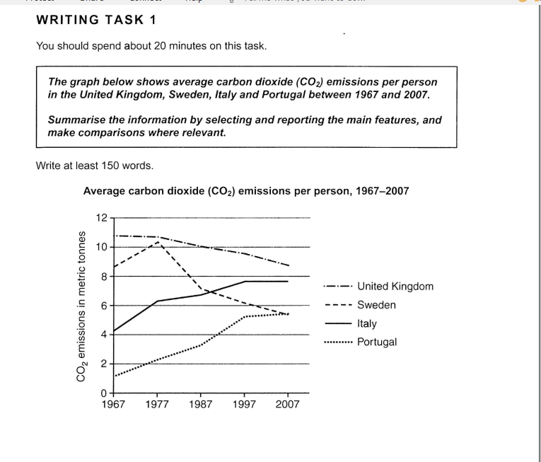
Top answer
Your question has been answered before here. htm You have two other accounts on this site. Please select one that you want to use.
- Your question has been answered before here.
- htm You have two other accounts on this site.
- Please select one that you want to use.
- htm
Get the Weekly English Kit 📬
New words, one handy idiom, and a 2-minute quiz — delivered to your inbox to keep your streak alive.
Your question has been answered before here.
You have two other accounts on this site.
 Related Questions