
Feedback and Score for IELTS Writing Task 1
The two graphs show the main sources of energy in the USA in the 1980s and the 1990s.
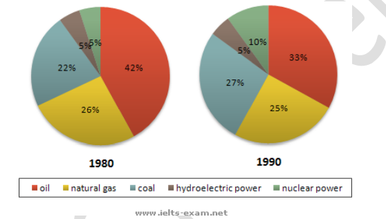
The two pie charts compare five main energy sources in the United States in 1980 and 1990.
Overall, there was an increase in nuclear power and coal whereas oil supply dropped during the period. Besides, the percentage of hydroelectric power and natural gas remained stable.
Oil had the largest percentage of energy in the USA in the 1980s, which made up for 42% of the country's energy. However, this number fell considerably to just a third of the total energy supply in 1990. In contrast, the proportions of coal and nuclear power increased in the 1980 - 1990 period. Coal energy rose from 22% to 27% whereas nuclear power doubled from 5% to 10% in 1990.
Interestingly, natural gas was the second largest energy source in 1980, which accounted for 26% of the total energy supply. However, it dropped by 1% and became lower than coal in 1990. Meanwhile, hydroelectric power was the smallest source of energy in America. It only provided 5% of America's energy in 1980 and this number remained the same ten years later.
Top answer
The two pie charts compare five main energy sources in the United States in 1980 and 1990. I ask myself on what basis is the comparison - green energy, efficiency, cost - how are these being compared? That is not a good description of the infographic.
- The two pie charts compare five main energy sources in the United States in 1980 and 1990.
- I ask myself on what basis is the comparison - green energy, efficiency, cost - how are these being compared?
- That is not a good description of the infographic.
- How many sources are there?
- What are they?
Get the Weekly English Kit 📬
New words, one handy idiom, and a 2-minute quiz — delivered to your inbox to keep your streak alive.
The two pie charts compare five main energy sources in the United States in 1980 and 1990.
I ask myself on what basis is the comparison - green energy, efficiency, cost - how are these being compared?
That is not a good description of the infographic.
How many sources are there? What are they? Your one sentence
 Related Questions