
Experts, please help with my Task 1 response!!!!!!
Dear, Experts.
I am trying to polish up my Task 1 essays. Please make comments and correct as much as you could.
Thank you so much in advance.
-----------
Here's the question:
-------------
And here's my response:
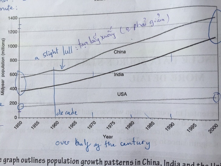
The line graph compares the population growth patterns in China, India and the United States over the second half of the 20th century. Overall, it shows constant growth, although at different rates in which China got a lead.
In detail, China's population started at just below 600 million people in 1950 and a dramatic rise was seen over half of a century since then despite a slight lull in 1960, concluding at nearly 1300 million in 2000. The growing rate was roughly 160 million per decade. The increase in Indian population moved in tandem with that of China, began at under 400 million people and constantly swelled to above 1200 million in 2000. Those patterns were not seen in the US population as it rose slightly and continuously from 180 million people in 1950 to just 230 million in 2000. Thus, the rate was modest at ten million people each decade.
Top answer
The line graph compares the population growth patterns in China, India and the United States over the second half of the 20th century. Overall, it shows constant all three countries experienced growth, although at different rates in which China ’ s population was always in the got a lead, India’s second, and the USA’s a distant third . In detail, China's population started at just below 600 million people in 1950, and but saw a dramatic ris e, was seen over half of a century since then despite a slight lull in 1960, concluding and ended at nearly 1 , 300 million in 2000.
- The line graph compares the population growth patterns in China, India and the United States over the second half of the 20th century.
- Overall, it shows constant all three countries experienced growth, although at different rates in which China ’ s population was always in the got a lead, India’s second, and the USA’s a distant third .
- In detail, China's population started at just below 600 million people in 1950, and but saw a dramatic ris e, was seen over half of a century since then despite a slight lull in 1960, concluding and ended at nearly 1 , 300 million in 2000.
- The growing Its growth rate was roughly 160 million per decade.
- The increase in the Indian population moved in tandem with that of Chin a.
Get the Weekly English Kit 📬
New words, one handy idiom, and a 2-minute quiz — delivered to your inbox to keep your streak alive.
The line graph compares the population growth patterns in China, India and the United States over the second half of the 20th century. Overall, it shows constant all three countries experienced growth, although at different rates in which China’s
 Related Questions