
Everyone please check my essay. Thanks.
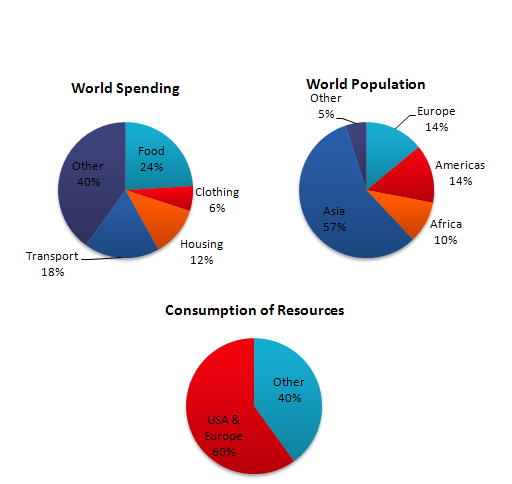
In this analysis we will examine three pie charts. The first one is headed ‘World Spending.’ The second is ‘World Population’ and the third is ‘Consumption of Resources.’
In the first chart we can see that people spend most of their income (24%) on food. In some countries this percentage would obviously be much higher. Transport and then housing are the next major expenses at 18% and 12% respectively. Only 6% of income is spent on clothing.
In the second chart entitled ‘World Population’, it is not surprising to find that 57% of people live in Asia. In fact China and India are two of the most populated countries in the world and they are both situated on this continent. Europe and the Americans account for nearly 30% of the total, whilst 10% of people live in Africa.
Finally, the third chart reveals that the USA and Europe consume a huge 60% of the world’s resource.
To sum up, the major expenditure is on food, the population figures are the highest for Asia and the major consumers are the USA and Europe.
Top answer
In this analysis we will examine three pie charts. ’ In the first chart , World Spending, we can see tha t, on average, people spend most of their income (24%) on food. In some countrie s, this percentage would obviously be much higher.
- In this analysis we will examine three pie charts.
- ’ In the first chart , World Spending, we can see tha t, on average, people spend most of their income (24%) on food.
- In some countrie s, this percentage would obviously be much higher.
- Transport and then housing are the next major expenses sectors at 18% and 12% respectively.
- Only 6% of income is spent on clothing.
Get the Weekly English Kit 📬
New words, one handy idiom, and a 2-minute quiz — delivered to your inbox to keep your streak alive.
In this analysis we will examine three pie charts. The first one is headed ‘World Spending.’ The second is ‘World Population’ and the third is ‘Consumption of Resources.’
In the first chart, World Spending, we can see that, on average, people spend most of their income (24%) on food.
 Related Questions