
Description of Pie chart. Can anyone help me assess this. Thank in advance ;)
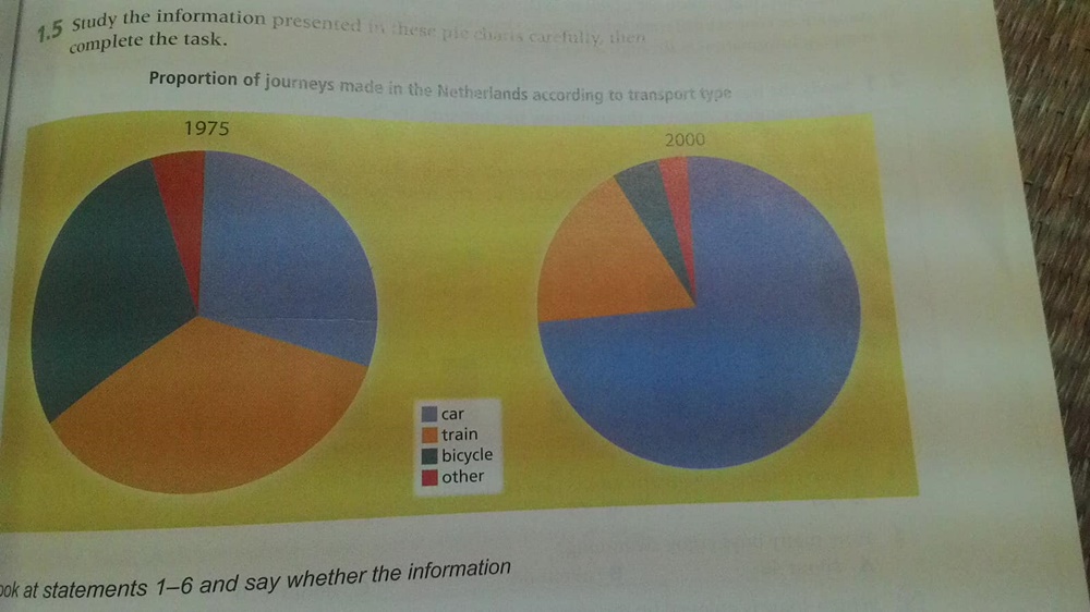
These pie charts shows proportion of journey made in the Netherland according to transport type: car, train, bicyle and other public transport in 1975 and 2000.
Overall, car traffic is the only transport type which its proportion of journey increased.
In 1795, train traffic was the most common transport type in the Netherland which contributed the largest proportion of journey around 35 percent. Car and bicycle also were the main transport types in this country with 25 percent and 23 percent respectively. While other just made 5 percent of journey.
In 2000,we see the increase in proportion of journey car made with almost 75 percent. This put car traffic on the top of these transport type. Train became the second popular type with 15 percent while this bicycle's proportion was 6 percent and other's was 4 percent.
Top answer
I have highlighted the text with errors. These pie charts shows (missing word) proportion of journey made in the Netherland according to transport type: car, train, bicyle and other public transport in two different years: 1975 and 2000. Overall, car traffic is the only transport type which its proportion of journey increased.
- I have highlighted the text with errors.
- These pie charts shows (missing word) proportion of journey made in the Netherland according to transport type: car, train, bicyle and other public transport in two different years: 1975 and 2000.
- Overall, car traffic is the only transport type which its proportion of journey increased.
- (ungrammatical.
- ) In 1795, trains traffic was the most common transport type in the Netherland which contributed the largest proportion of journey (wrong form, missing punctuation) around 35 percent.
Get the Weekly English Kit 📬
New words, one handy idiom, and a 2-minute quiz — delivered to your inbox to keep your streak alive.
I have highlighted the text with errors.
These pie charts shows (missing word) proportion of journey made in the Netherland according to transport type: car, train, bicyle and other public transport in tw
Model Essay:
Paragraph 1: Description of the graphic:
The two pie charts (1975 and 2000) compare the relative usage of three different specific transport types (car, train, bicycle) for journeys made in the Netherlands. Since these three categories did not add up to 100%, there is a fourth "miscellaneous" category for all other forms of public transport.
Paragraph 2: General
 Related Questions